










Junk Journal Elements Inspiration: Layering Ideas You’ll Love
What Is a Junk Journal and Why Layering Makes All the Difference
A junk journal is a handmade book crafted from recycled, repurposed, and otherwise “junky” materials — think old book pages, paper bags, tea-stained envelopes, fabric scraps, and vintage ephemera. Unlike traditional journals or scrapbooks, junk journals embrace imperfection as an art form. There are no strict rules, no perfect color palettes required, and no pressure to achieve a polished aesthetic. The beauty lies in the texture, the stories embedded in found materials, and the deeply personal nature of each page you create.
Layering is the secret language of junk journaling. When you layer elements — torn papers beneath hand-stamped images beneath washi tape beneath a handwritten note — you create visual depth that a flat page simply cannot achieve. Each layer adds a new story, a new texture, a new color dimension. It mimics the way memories accumulate over time: one on top of another, each one slightly altering the ones beneath it. Layering transforms a collection of scraps into something that feels alive and meaningful, full of hidden surprises tucked under every flap and fold.
Many beginners feel overwhelmed by the blank page, unsure where to start or how to make their elements look cohesive rather than chaotic. The good news is that layering itself solves this problem. When you build a page from the bottom up — starting with a base layer and gradually adding more intentional elements — you naturally create harmony between disparate materials. The layers blend and unify colors, patterns, and textures in a way that no single perfectly chosen element could do alone. Understanding this principle changes everything about how you approach your junk journal pages.
Gathering Your Junk Journal Elements: What to Save and Why
The hunt for junk journal materials is half the joy. Before you can layer beautifully, you need a rich stash of varied elements to work with. Start by saving things most people throw away without a second thought: the inside of security envelopes with their lovely geometric patterns, the tissue paper from gift bags, aged paperback book pages, grocery bags with interesting typography, and even paper coffee cups. Vintage items are particularly prized — old ledger sheets, dictionary pages, sheet music, and handwritten letters carry a nostalgic energy that printed reproduction papers simply cannot replicate.
Beyond paper, fabric and fiber elements add extraordinary texture to junk journal pages. Burlap ribbon, lace trim, twine, cheesecloth, and even worn denim can be incorporated into your layers. These materials introduce a tactile quality that invites the viewer to reach out and touch the page. Fabric elements also behave differently than paper under paints and inks — they absorb color in unpredictable, gorgeous ways, creating soft, blended effects that become unique backgrounds or focal-point embellishments depending on how you use them.
Collect these materials in an organized but generous way. Many experienced junk journalers keep a dedicated bin or drawer sorted loosely by color family, so when they sit down to create, they can quickly pull a handful of elements that will play well together. Don’t limit yourself to “pretty” things — stained, torn, faded, and worn materials often make the most compelling layers because they already carry visible history. That old receipt with a coffee ring, the envelope with a cancelled stamp, the magazine page with a circle of torn text — these imperfect pieces are your greatest treasures.
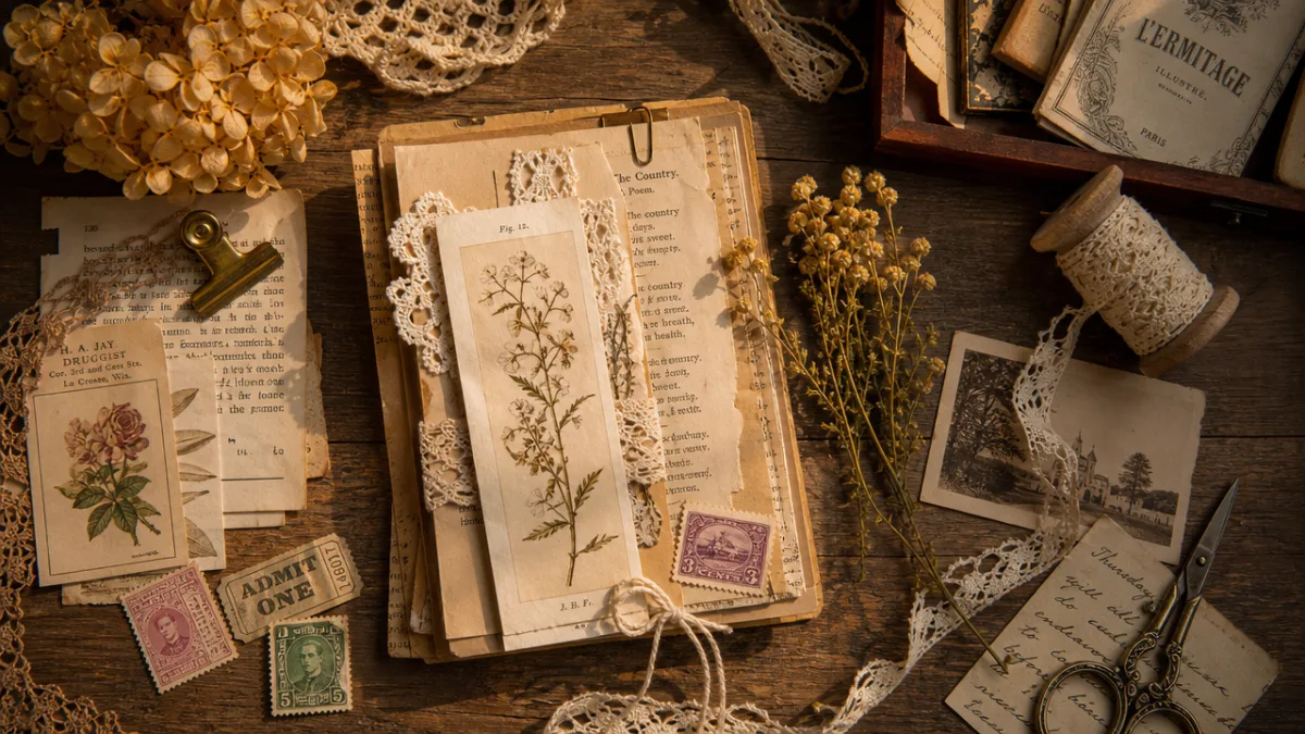
Base Layers: Building the Foundation of Your Page
Every great layered junk journal page begins with a thoughtful base layer. This foundational layer sets the mood, the color temperature, and the overall feel of everything that will come after it. Common base layer choices include gesso-painted book pages, tea-dyed tissue paper, brown paper bag torn into a pleasing shape, or a collage of overlapping book text pages. The base layer doesn’t need to be a single material — it can itself be a mini-collage of two or three elements that together create a unified backdrop for your composition.
Color plays a crucial role at the base layer stage. Many junk journalers work in a warm, vintage palette — creams, tans, sepia tones, dusty roses, and muted greens — because these colors naturally recede and allow upper layers to pop without visual competition. Others prefer a bolder base, using acrylic paint washes in deep teal or burnt sienna to create a moody, dramatic foundation. Whatever palette you choose, consider applying a light wash of watered-down paint over your base layer materials to unify them. This simple technique makes mismatched papers look intentionally curated rather than randomly assembled.
Texture at the base level adds depth even before a single decorative element is applied. Try crumpling your base paper before flattening and adhering it — the resulting wrinkles catch light beautifully and give the page an aged, well-loved quality. Alternatively, apply cheesecloth to a wet gesso base, press it into the surface, then remove it before it dries completely. This leaves behind an impression of the weave that creates a subtle, fabric-like texture across your entire page. These foundational texture choices will influence how every subsequent layer looks and feels.
Mid Layers: Adding Depth, Pattern, and Visual Interest
Once your base is established, the mid layers are where the real magic of junk journaling begins to emerge. These are the elements that build visual complexity and begin to tell the story of your page. Mid layers typically include larger decorative papers — vintage sheet music, floral wrapping paper, map fragments, or printed tissue — torn or cut into irregular shapes and overlapped across the base. The key here is variety: mix large pieces with small ones, dense text with open imagery, geometric patterns with organic shapes.
Washi tape is an indispensable mid-layer tool. A strip of washi tape can define a border, anchor a piece of paper that otherwise looks adrift on the page, or introduce a pop of color that ties together distant elements in your composition. Use it straight, torn into small pieces, layered over other papers, or even folded back on itself to create a flag-like embellishment. Because washi tape is semi-transparent, it layers beautifully over printed materials, allowing the imagery beneath to show through while adding a new color or pattern dimension on top.
Stamping and stenciling are mid-layer techniques that deserve special attention. Applying an ink stamp — a floral motif, an antique postmark, a handwritten-style script — over your collaged base unifies disparate papers beneath it because the stamp impression crosses multiple surfaces simultaneously. Similarly, running a stencil and a palette knife loaded with texture paste across several overlapping papers creates a continuous pattern that reads as intentional design rather than random assembly. These techniques are especially powerful because they bridge the gap between your various base materials, making the whole composition feel planned and cohesive.

Top Layers and Focal Points: Making Your Page Sing
The top layer is where your page finds its voice. This is the layer of focal point elements — the things that draw the eye first and give the page its central subject or story. Focal point elements in junk journaling typically include vintage portrait cutouts, botanical illustration clippings, meaningful word clusters, large decorative keys or charms, or a single beautifully aged envelope with a folded letter inside. Whatever you choose, the focal point should be the most visually prominent element on the page, positioned with intention rather than dropped randomly into the composition.
Dimension is the hallmark of truly spectacular top layers. Rather than gluing everything flat, introduce elements that lift away from the page surface. Fold a piece of paper in half and adhere only one side, creating a pocket that hides a tag or a tiny note. Curl the edges of a paper flower petal around a pencil to give it a three-dimensional bloom. Layer a piece of ephemera under a scrap of torn tulle. Stack multiple layers of the same image, cut to slightly different sizes, and adhere them with foam dots to create a raised, sculptural element. These dimensional details transform a page from a flat collage into a tactile artwork.
Finishing touches at the top layer level are what separate a good page from a breathtaking one. A few techniques to consider include dry brushing a little white gesso over the entire assembled page — this mutes overly bright colors and creates a hazy, dreamlike quality. Inking the edges of every paper element with a brown or black ink pad unifies disparate materials and gives them each a finished, aged look. Adding a final splatter of watered-down paint in a complementary color ties all your layers together with a unifying gesture. These finishing steps should feel light-handed; their job is to harmonize, not overpower.
Pockets, Tags, and Interactive Elements: Journaling That Engages
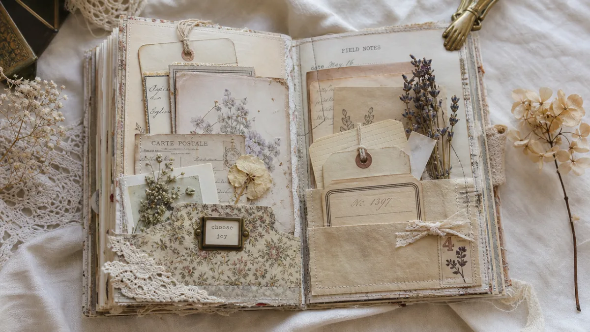
One of the most beloved aspects of junk journaling is the incorporation of interactive elements — pockets, tags, flip-outs, and hidden compartments that make the journal an experience to explore rather than simply to view. A pocket can be as simple as an envelope adhered to the page with one flap left open, or as elaborate as a multi-layered fabric pocket with a button closure. Inside these pockets, tuck journaling tags, tiny folded notes, pressed flowers, fortune cookie slips, or any other small treasure that fits the page’s theme. The act of discovering these hidden elements makes the journal feel like a gift that keeps giving.
Tags are among the most versatile junk journal elements in your layering arsenal. A tag is simply a piece of cut paper or cardstock with a hole punched at one end, threaded with twine or ribbon so it can be pulled from a pocket or tied to an element on the page. On one side of the tag, you might stamp an image or apply a piece of vintage ephemera. On the other, you leave space for journaling — dates, memories, quotes, or lists. Tags add dimension when they’re left slightly lifting away from the page, and they add interactivity because they invite the viewer to reach out and flip or pull them.
Consider these interactive element ideas for your next junk journal page spread:
- A tea-dyed envelope pocket holding a handwritten letter to your future self, sealed with a wax stamp.
- A folded map that opens to reveal a journaling area inside, with marked locations that hold personal meaning.
- A mini booklet made from folded book pages, bound with a piece of twine, tucked into a sewn pocket on the page.
- A library card pocket adhered to the page with a card inside listing books that changed your life.
- A paper bag flap that lifts to reveal additional ephemera layers and journaling space beneath it.
The beauty of interactive elements is that they solve the classic junk journaler’s dilemma: too many beautiful things to fit on one page. By building in hidden layers and compartments, you can incorporate significantly more materials and more journaling without the page feeling cluttered. Interactive elements also slow down the viewer, encouraging them to linger and explore rather than glancing quickly and moving on. They transform your junk journal from a passive art object into an active experience — one that reveals itself gradually, like a good story.
Color Harmony and Cohesion: Making All Your Layers Work Together
One of the most common concerns among new junk journalers is whether their pages will look cohesive or chaotic. The answer almost always lies in color harmony. Even the most disparate collection of materials — a piece of floral wrapping paper, a torn ledger sheet, a printed napkin, a book page, and a fabric snippet — will look intentional and unified if they share a common color story. Before you begin a page, pull your materials into a loose pile and look at the dominant colors. Are they warm or cool? Muted or saturated? Let that answer guide which additional elements you reach for.
A practical approach to color cohesion in junk journaling is the three-color rule: choose a dominant color, a secondary color, and an accent color, and make sure each layer contributes at least one of these three colors to the composition. The dominant color should cover the most page real estate — it’s usually the color of your base layer or the largest paper piece. The secondary color appears in medium-sized elements and mid-layer materials. The accent color appears sparingly in small elements and details, providing visual energy without overwhelming the palette. This simple framework works for every color family and every style of junk journal page.
Ink edges and paint washes are your greatest color-cohesion tools. When individual elements feel like they’re floating independently rather than belonging to the page, a pass of the same ink color around every element’s edge will visually connect them. Similarly, a thin wash of a single watercolor or acrylic color across the entire assembled page surface — transparent enough to let everything beneath show through — creates an instant color unifier. Many experienced junk journalers keep a palette of three to five ink colors they return to repeatedly across a project, so that every page in a journal shares a subtle color signature even when the content and materials vary wildly.
Finding Inspiration and Making Junk Journaling Your Own
Inspiration for junk journal pages is everywhere once you begin to see the world through the layered lens of this art form. Pinterest boards dedicated to vintage ephemera, antique botanical illustrations, old postcards, and aged paper textures are rich visual resources. Instagram and YouTube communities of junk journalers share process videos that reveal how seemingly random collections of materials come together into cohesive pages. Beyond the digital world, antique stores, estate sales, library discard bins, and your own family’s boxes of old photographs and letters are treasure troves of authentic vintage material that no printed reproduction can match.
The most important thing to remember as you develop your junk journaling practice is that the rules — to the extent any exist — are yours to define. Some junk journalers work in a strictly vintage, monochromatic palette. Others embrace bold color, maximalist layering, and contemporary mixed media. Some focus on quiet, meditative pages with minimal elements and generous white space. Others fill every millimeter with layered papers, stamps, and embellishments. None of these approaches is more correct than another. Your junk journal is a reflection of your aesthetic sensibility, your personal history, and your creative voice. The more authentically you make it yours, the more compelling and meaningful it becomes.
Start before you feel ready. This is perhaps the single most valuable piece of advice for any aspiring junk journaler. You will never have the perfect collection of materials, the ideal workspace, or the fully developed skill set you imagine you need. Begin with what you have — old magazines, a paper grocery bag, a rubber stamp, a piece of ribbon, and a bottle of craft glue — and make your first page messy and imperfect and completely your own. The skills develop through practice, the eye for composition sharpens with every page, and the stash of beautiful materials grows organically over time. What matters most is beginning, layering one humble element on top of another, and discovering what emerges when you trust the process.








What do you think?
It is nice to know your opinion. Leave a comment.