










Learn How to Paint a Gouache Flower: A Complete Guide for Beginners and Beyond
Gouache painting has experienced a remarkable renaissance in recent years, and for good reason. This versatile, water-based medium sits beautifully between watercolor and acrylic, offering artists the best of both worlds: the luminosity of transparent washes combined with the bold opacity of opaque coverage. When it comes to painting flowers, gouache truly shines, allowing you to layer petals with confidence, correct mistakes easily, and achieve colors so rich and velvety they seem to glow from the page.
Whether you are picking up a paintbrush for the very first time or transitioning from another medium, gouache flowers are one of the most rewarding subjects you can choose. The forgiving nature of the paint means you can rework areas that aren’t quite right, build up texture, and experiment freely without the anxiety that sometimes accompanies more unforgiving media. This guide will walk you through every step of the process, from gathering your supplies to adding those final luminous details that bring a painted flower to life.
Understanding Gouache: What Makes It Perfect for Floral Painting
Gouache is an opaque watercolor made from pigment, water, and a binding agent, typically gum arabic, with an added white chalk or pigment to increase opacity. Unlike traditional watercolor, which relies on the white of the paper to create luminosity, gouache can be painted light over dark, opening up a completely different approach to building an image. This quality is particularly valuable when painting flowers, where soft highlights and bright petal edges often sit against deeper, richer tones.
One of the most distinctive characteristics of gouache is its matte finish when dry. This gives finished paintings a velvety, poster-art quality that many artists find irresistible. The paint dries slightly lighter than it appears when wet, which takes some getting used to, but with practice this behavior becomes second nature. For floral work, this matte quality can beautifully capture the soft, dusty surface of petals like those of a poppy or a ranunculus, lending an almost tactile realism to the finished piece.
Gouache is also highly reactivatable once dry. A little moisture will re-wet the surface, which means you can blend edges even after the paint has dried, or lift color from areas you want to soften. While this quality demands care when layering so that lower layers do not muddy upper ones, it is enormously useful when you want to integrate colors seamlessly across a petal or soften the transition between shadow and light. For beginners, this gives you a safety net that many other mediums simply do not offer.
It is worth noting that gouache comes in several varieties: traditional gouache, acrylic gouache (which dries permanently and will not reactivate), and watercolor gouache, which leans more toward the transparent end of the spectrum. For floral painting exercises, traditional gouache is the most beginner-friendly option, while acrylic gouache suits those who want more durability and permanent layering without risk of reactivation.
Gathering Your Materials: What You Need Before You Begin
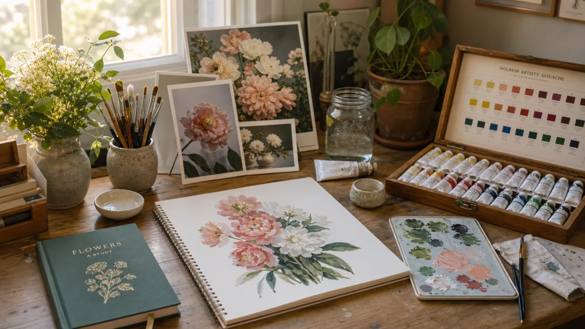
Starting with the right materials makes an enormous difference to your experience and the quality of your results. For gouache flower painting, you do not need an overwhelming array of supplies, but choosing well within a modest budget will set you up for success. The good news is that gouache is generally more affordable than oil paint, and a small selection of quality tubes goes a long way since the paint is used in relatively small quantities diluted with water.
For paints, a starter palette might include titanium white, ivory black, cadmium yellow or hansa yellow, cadmium red or a warm rose, ultramarine blue, and a bright leaf green or viridian. From these six colors you can mix a remarkable range of floral hues. Adding a tube of raw umber and perhaps a violet or magenta will broaden your possibilities further. Brands like Winsor and Newton, Holbein, and Turner are widely praised for their consistency and pigment density, and all offer student-grade ranges that perform beautifully.
Your choice of paper or surface matters enormously with gouache. Unlike watercolor paper, gouache does not require a heavily textured surface, though cold-press watercolor paper of at least 300gsm works wonderfully. Many gouache artists also love painting on smooth Bristol board, toned papers in grey or tan, or even illustration board. Toned surfaces are particularly exciting for floral work because they provide a mid-tone ground, allowing you to simultaneously paint shadows darker than the background and lights brighter, giving the flower an immediate sense of volume and atmosphere.
In terms of brushes, a small selection covers most needs. Round brushes in sizes 2, 4, and 6 will handle the majority of petal shapes and details. A flat brush is useful for broader washes and background areas. Synthetic brushes work perfectly well with gouache and are considerably more affordable than natural hair alternatives. Keep a jar of clean water nearby at all times, and use two jars if possible: one for rinsing brushes and one for mixing clean water into your paint, so you always have fresh, uncontaminated water available.
- Paints: Titanium white, ivory black, cadmium yellow, cadmium red or rose, ultramarine blue, viridian green, and optionally violet or raw umber.
- Brushes: Round brushes in sizes 2, 4, and 6; one flat brush for backgrounds.
- Surface: Cold-press watercolor paper (300gsm minimum), Bristol board, or toned paper.
- Other essentials: Two jars of water, a ceramic or plastic palette with wells, paper towels, and a pencil for light initial sketching.
Choosing and Sketching Your Flower Reference
Before a single drop of paint touches your surface, taking time to understand the structure of your chosen flower pays enormous dividends. Flowers are deceptively complex: each petal has its own turn, curve, and relationship to the light source, and the way petals overlap creates the depth and realism that separates a convincing floral painting from a flat, diagrammatic one. For beginners, starting with a single bloom rather than a full bouquet is highly recommended. A garden rose, a peony, a dahlia, or even a simple daisy each offer different but achievable challenges.
Working from a real flower or a high-quality photograph gives you something to observe closely and honestly. As you study your reference, ask yourself a series of questions that will guide your painting decisions. Where is the light coming from? Which petals catch the most light, and which fall into shadow? Where do petals overlap, and how does that create depth? What is the darkest value in the flower, and what is the lightest highlight? These observations, made before you touch brush to surface, will inform every mark you make and result in a more coherent, convincing painting.
When sketching your flower onto your surface, keep the lines light and minimal. Gouache will cover pencil lines, but heavy, dark graphite can sometimes muddy your paint layers, especially in lighter areas. A simple contour sketch noting the outer shape of the bloom, the positions of major petals, and the location of the center is all you need. Avoid shading or cross-hatching at this stage; that is the paint’s job. If you are working on toned paper, a light-colored pencil such as a white or yellow pastel pencil will show up better than graphite.
Some artists prefer to skip the pencil sketch altogether and paint directly, blocking in the main shapes with a mid-tone color and building up from there. This alla prima approach is liberating once you have a little practice, and gouache’s opacity means you can freely paint over early marks. Whichever approach you take, remember that the sketch is merely a road map, not a rigid blueprint. As you paint and observe, you may discover that a petal needs to shift or a shadow falls differently than you initially drew it, and that is entirely normal and perfectly fine.
Painting the Flower Step by Step: Building Form with Color and Value
Begin by mixing a mid-tone version of your flower’s main color. If you are painting a pink rose, mix a soft mid-pink using your red or rose with white added. This mid-tone will serve as your base and provide a reference point against which you will judge both your darks and your lights. Apply this base color across all the petals using a size 4 or 6 round brush, keeping the coverage relatively even and consistent. Do not worry about perfection at this stage; you are simply establishing the color family of the flower and covering the white of the page or the tone of your toned paper.
Once the base layer is dry, which with gouache typically happens within a few minutes depending on humidity, begin observing where the shadows fall. Mix a shadow color by adding a deeper, cooler version of your base color. For a pink flower, this shadow might be a muted rose with a touch of violet or ultramarine added to cool and deepen it. Avoid simply adding black to your base color, as this tends to produce dull, muddy shadows. Instead, think about the color temperature of your shadows: they are generally cooler than the lit areas, which are warmer and more saturated.
Apply your shadow color to the darker areas of the petals, particularly where one petal overlaps another or where a petal curves away from the light. Use a slightly smaller brush for this, such as a size 4, and paint with confident strokes that follow the curve and direction of each petal. You do not need to blend obsessively at this point; allow the transitions to remain somewhat defined. In the next step, you will have the opportunity to soften and blend edges if needed, or you may find you prefer the clean, graphic quality of distinct tonal transitions that gouache naturally produces.
Now comes one of the most satisfying moments in gouache flower painting: adding the highlights. Mix a lighter, warmer version of your base color, often simply your base with more white or a touch of yellow added. Apply this to the areas of each petal that catch the most light, typically the topmost curves and outer edges that face the light source. With gouache, you can apply these light marks directly over your shadow and mid-tone areas, confident they will hold. This is where the opaque nature of gouache truly earns its keep. A few crisp, well-placed highlights can transform a flat painting into something that feels genuinely three-dimensional and alive.
- Mix and apply a mid-tone base color across all petals to establish your color family.
- Mix a cooler, deeper shadow color and apply it to areas of overlap and petal curves away from the light.
- Mix a warmer, lighter highlight color and apply it to the topmost, light-facing surfaces of each petal.
- Step back and assess the overall balance of lights and darks before proceeding to fine details.
- Add the flower center, any stamen details, and refine petal edges with a fine brush.
Adding Leaves, Stems, and Background: Completing the Composition
No flower painting feels complete without some treatment of the surrounding foliage, and gouache handles greens with particular beauty. For leaves, observe carefully that green is rarely a single flat hue: leaves in sunlight appear bright and warm, almost yellow-green, while leaves in shadow are deeper, cooler, and often lean toward blue-green or even a grey-green. Mixing a range of greens from your viridian or sap green base, warm-shifted with yellow and cool-shifted with blue, will give your foliage a sense of naturalism and depth that flat single-color leaves cannot achieve.
Paint leaves and stems using confident, directional brushstrokes that echo the growth direction of the plant. For elongated leaves, a single stroke pulled from the base to the tip with a well-loaded brush creates a satisfying, naturalistic shape. The stem can be painted with a fine round brush, varying the pressure slightly as you pull to capture the natural slight variation in width. Where the stem meets the flower head, deepen the color to create a subtle shadow that anchors the bloom. Small details like serrated leaf edges or the fine veining within a leaf can be added last with a very fine brush loaded with a contrasting lighter or darker green.
The background is perhaps the most important compositional decision in a floral painting, yet it is often the most neglected. A thoughtful background can elevate a technically modest painting to something truly atmospheric, while a careless one can undermine excellent foreground work. With gouache, you have enormous flexibility. You might choose to leave toned paper unpainted for a warm, unified ground, apply a loose wash of a contrasting or harmonious color, or paint a soft, atmospheric dark background that makes your flower pop with brilliant luminosity. Whatever you choose, apply the background after your main flower is established so you can neatly cut around the edges.
When painting around the edges of your petals with background color, this is the moment where gouache truly demonstrates its superiority over many other media for this kind of work. Because you can paint light over dark, you can first lay in a darker background freely, even allowing it to overlap your flower slightly, and then come back with your petal colors to sharpen and refine the edge from the flower side. This back-and-forth refinement produces beautifully crisp petal edges and gives you precise control over the silhouette of your bloom, which is critical to making a flower reading as a specific species rather than a generic shape.
Common Mistakes and How to Avoid Them
Even experienced painters run into predictable challenges when working with gouache, and knowing these pitfalls in advance allows you to sidestep frustration and develop good habits from the start. One of the most common issues is over-diluting the paint, which strips away its opacity and causes it to behave more like watercolor. While this is sometimes a deliberate technique, it is often an accidental one. Aim for a consistency similar to heavy cream or thick yogurt for most applications. If you can see the paper or lower layers clearly bleeding through your stroke, your paint is likely too thin.
Overworking wet paint is another frequent challenge, particularly for those who have come from oil or acrylic painting and are accustomed to blending extensively on the surface. Gouache blends best when worked quickly and decisively, before the surface starts to dry. Going back into an area that has begun to dry causes the lower layer to reactivate and the colors to lift and muddy. If you need to revisit an area, allow it to dry completely first, then apply a fresh layer on top. With practice, you learn to read when the paint is at the right consistency and dryness for each technique.
Neglecting value contrast is a subtler but pervasive mistake that keeps many flower paintings looking flat or unconvincing. It is tempting to focus primarily on color, choosing beautiful pinks and corals and greens, while ignoring how light and dark those colors are. A flower painted entirely in mid-values, even beautiful mid-values, will lack the drama and dimension that makes a painting sing. Make a deliberate effort to push your darks darker, particularly in areas of deep shadow between petals, and your lights lighter, particularly on the most directly lit petal surfaces. This range of value is what creates the illusion of three-dimensional form.
- Paint too thin: Aim for a heavy cream consistency; thin paint loses opacity and vibrancy.
- Overworking wet layers: Work quickly and decisively; allow layers to dry before revisiting them.
- Neglecting value contrast: Consciously push your shadows darker and your highlights lighter than feels comfortable.
- Skipping observation: Study your reference carefully before and during painting; frequent comparison prevents drifting off course.
- Using black to darken: Add complementary colors or cool blues and violets to create rich, natural-looking shadows.
Finally, a mistake that is easy to overlook is painting without enough reference observation during the process. Many beginners sketch a flower, set the reference aside, and then paint from memory or imagination. Returning frequently to your reference throughout the painting process keeps your colors, shapes, and values anchored in observation. This habit does not constrain creativity; on the contrary, it provides the raw visual information from which confident creative decisions can be made. The more you look, the more you will see, and the more you see, the better your painting will become.
Developing Your Practice: Moving Forward with Confidence
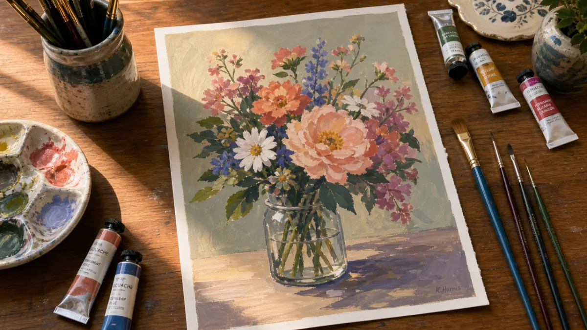
Completing your first gouache flower is a genuine milestone, but it is really just the beginning of a deeply rewarding creative journey. The skills developed through floral painting, careful observation, understanding of light and shadow, color mixing, and confident brushwork, all transfer directly to every other subject you might wish to explore. More immediately, you will find that each new flower you attempt reveals fresh challenges and opportunities: a tulip demands a different approach than a rose, and a wildflower meadow composition requires thinking about spatial depth in ways that a single bloom does not.
Building a regular painting practice, even if only for twenty or thirty minutes several times a week, accelerates growth dramatically. Consistency matters far more than the length of individual sessions. Keep a sketchbook dedicated to gouache studies, and use it freely without attachment to the results. Small, quick studies, a single petal, a color mixing experiment, a five-minute gesture of a leaf, build visual vocabulary and technical confidence faster than longer, more labored paintings often do. Give yourself permission to produce work that does not meet your aspirations; the gap between what you can see and what you can currently execute is precisely where learning lives.
As your technical facility grows, begin exploring the expressive possibilities of gouache beyond realistic representation. Gouache lends itself beautifully to loose, gestural flower paintings where broad strokes suggest petals rather than describing them in detail. It suits graphic, flat illustration work as well as richly tonal, almost classical studies. The medium is equally at home in a warm, impressionistic palette evoking summer gardens and in bold, contemporary designs with high-contrast colors and stylized shapes. Exploring these different modes of expression will keep your practice lively and help you discover your own unique visual voice.
Seek out the work of artists who paint flowers in gouache and study how they approach the challenges you have encountered. Artists like Misty Trione, Peggy Dean, and countless illustrators working in the botanical and surface design fields offer a wealth of inspiration and often share process videos and tutorials that illuminate their techniques. Joining an online or in-person community of gouache painters provides encouragement, accountability, and the particular motivation that comes from seeing others work through the same challenges you face. Painting need not be a solitary pursuit, and sharing your work, however imperfect you feel it to be, is an act of courage that consistently accelerates growth.
Most importantly, return again and again to the simple pleasure of observing a real flower. Hold a stem up to the light and watch how the thin petals become translucent, how the color deepens at the base and lightens toward the edge. Notice the subtle blues and purples hidden within what appears to be a pure red. See how a single petal, examined closely, contains an entire landscape of color, texture, and tone. This quality of attentive looking is at the heart of all good painting, whatever the medium, and it is a skill that rewards a lifetime of practice. Gouache, with its beautiful, forgiving, endlessly versatile nature, is one of the finest tools you can have in hand as you develop it.








What do you think?
It is nice to know your opinion. Leave a comment.