










Packaging Design: Scented Candle Collection for a Copenhagen Homeware Brand
The Art of Scandinavian Packaging Design
Copenhagen has long stood as one of the world’s foremost capitals of design, a city where aesthetics are woven into the very fabric of daily life. For a homeware brand rooted in this tradition, packaging is never an afterthought — it is a primary expression of identity. When it comes to a scented candle collection, the packaging must do extraordinary work: it must communicate fragrance before the lid is even lifted, convey warmth and luxury through touch and sight, and reflect the restrained elegance that defines the Scandinavian design ethos. Every line, every material choice, and every typographic decision carries the weight of that cultural heritage.
What makes Copenhagen-born packaging design so distinctive is its commitment to purposeful simplicity. Unlike maximalist traditions that pile on ornamentation to signal value, the Nordic approach strips everything back to what is essential and lets quality of execution speak for itself. For a scented candle collection, this means allowing the colour palette, material texture, and subtle graphic language to do the heavy lifting. The result is packaging that feels expensive and considered without ever feeling loud or ostentatious — a balance that very few design cultures manage to strike with such consistent success.
This philosophy extends into the emotional register of the packaging. A scented candle is fundamentally a product that promises an atmosphere, a feeling, a moment of domestic ritual. The packaging design must therefore prime the consumer emotionally before the product is ever experienced. Through carefully chosen muted tones that evoke hygge — the Danish concept of cosy contentment — and through materials that reward the sense of touch, great Copenhagen homeware packaging transforms the unboxing moment into an extension of the product experience itself.
Concept Development and Brand Identity
The starting point for any successful packaging project is a deep dive into brand identity. For a Copenhagen homeware brand, this means understanding not just the visual language already established across the brand’s touchpoints, but also the underlying values: craftsmanship, sustainability, intimacy, and a connection to the natural Scandinavian landscape. During concept development, designers explore how these values can be translated into physical form — into shapes, surfaces, and systems that will hold together across an entire candle collection while allowing individual fragrances to have their own distinct character.
Mood boards play a crucial role in this early phase, pulling together references from architecture, textiles, ceramics, and even the quality of northern light during different seasons. A fragrance inspired by coastal pine forests might draw visual cues from the grey-green palette of Danish heathlands, while a warmer, more amber-toned scent might reference the glow of candlelight inside a timber-framed country house. These visual references are not applied literally — they are distilled into colour swatches, texture directions, and typographic moods that become the backbone of the design system.
Naming conventions are another vital component of concept development. For a scented candle collection, fragrance names carry enormous descriptive and emotional weight. A Copenhagen brand might favour evocative Nordic place names, abstract sensory words drawn from the Danish language, or quietly poetic phrases that hint at a mood without over-explaining it. These names must work typographically at small scales on the packaging and must reinforce the brand’s personality — sophisticated, warm, and rooted in a specific sense of place — without tipping into cliché or the kind of pseudo-Scandinavian aesthetic that global trend culture sometimes produces.
Material Selection and Sustainable Choices
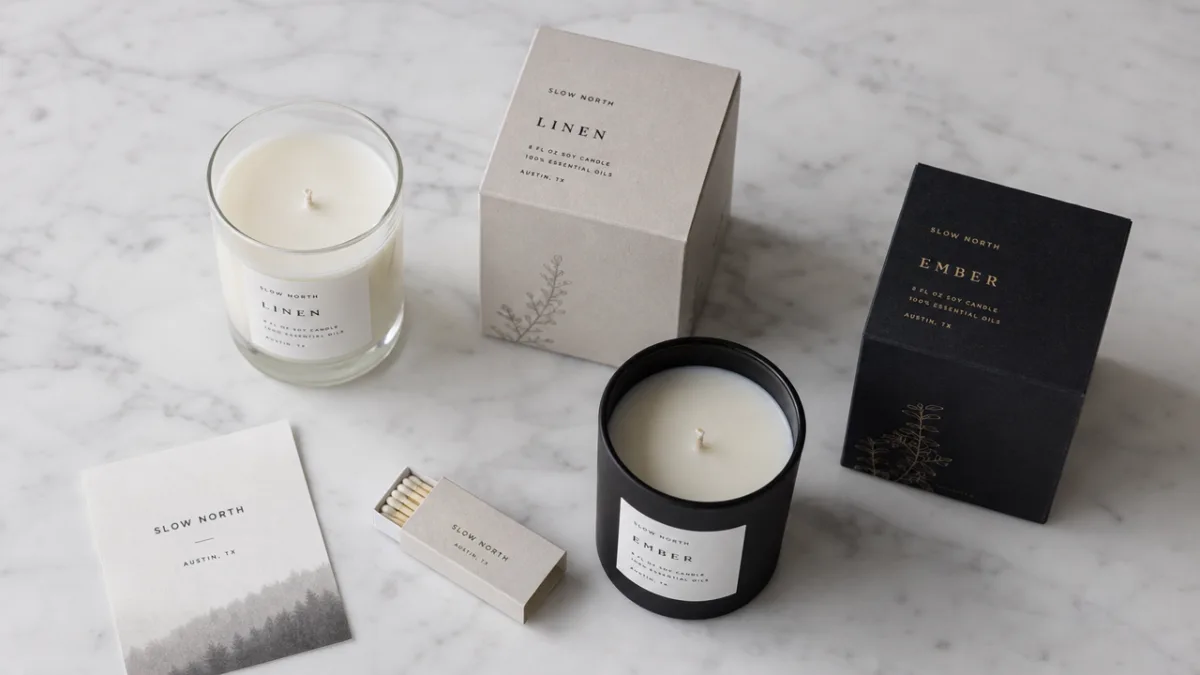
Material selection is where the values of a Copenhagen homeware brand become most tangible. In an era of heightened environmental awareness, Scandinavian brands are often leaders in integrating genuine sustainability into their material choices rather than simply using it as a marketing claim. For a scented candle collection, this might mean opting for uncoated recycled card stock that has a beautiful natural tooth to it, or exploring FSC-certified papers with subtle plant-based dye colours that age gracefully rather than fading to something unattractive. The material should feel worthy of being kept long after the candle inside has burned down.
Beyond paper and card, a premium candle collection from a Copenhagen homeware brand might explore complementary materials for structural or decorative elements. Embossed details pressed directly into uncoated board can add tactile luxury without resorting to foil stamping, which can feel at odds with a sustainability narrative. Cotton ribbon ties, wax seals using vegetable-based wax, or a simple band of beautifully printed lokta paper can elevate the perceived value of the packaging enormously while keeping material complexity manageable and recyclability high. Each element should justify its presence both aesthetically and functionally.
The candle vessel itself is part of the packaging story. A Copenhagen brand might choose frosted glass with a heavy base that sits with quiet authority on a shelf, or a matte ceramic vessel that the consumer will genuinely want to repurpose as a planter or storage container after the candle is finished. Encouraging this kind of second life is not just good sustainability practice — it keeps the brand present in the consumer’s home long after the purchase. When the vessel, the outer packaging, and the label or sleeve all speak the same visual language, the total object becomes something genuinely coherent and covetable.
Typography and Colour Palette
Typography in Scandinavian packaging design tends toward the quietly confident. For a Copenhagen candle collection, a designer might pair a geometric sans-serif — something with roots in the modernist tradition, perhaps reminiscent of early twentieth-century Danish graphic design — with a carefully chosen serif for the fragrance names, lending them a slightly more literary, intimate quality. The relationship between typefaces should feel considered but never effortful; the hierarchy of information (brand name, fragrance name, fragrance notes, volume) should be immediately legible without aggressive size contrasts or excessive weight variation.
Colour is where the packaging communicates fragrance character most immediately, and for a multi-scent collection, the colour coding system must be coherent enough to read as a family while differentiated enough that each candle has its own distinct identity on a retail shelf. A Copenhagen brand might anchor the collection in a shared off-white or warm stone background across all packaging, with each fragrance identified through a secondary colour applied to a band, a spot of wax, or a printed element. These secondary colours might reference botanical pigments — a dusty sage, a faded ochre, a slate blue — keeping the palette feeling natural and considered rather than bright or synthetic.
Negative space is as important as the graphic elements themselves. A hallmark of great Scandinavian design is the willingness to let things breathe, to resist the temptation to fill every available surface with information or decoration. On a candle label or sleeve, generous margins and restrained text blocks signal confidence and quality. The consumer understands intuitively that a brand comfortable enough to leave space on its packaging doesn’t need to shout to be heard. This restraint also ensures the packaging photographs beautifully in lifestyle and editorial contexts — an increasingly important consideration in an age when product photography on social media platforms like Pinterest drives significant consumer discovery.
Label and Sleeve Design Details
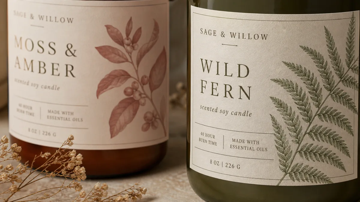
The label or sleeve is the primary graphic surface of any candle packaging, and getting it right requires balancing a remarkable number of competing demands. It must carry all necessary regulatory and product information while preserving the aesthetic integrity of the design. For a Copenhagen homeware brand with a heritage of refined visual communication, the solution often lies in a beautifully structured information hierarchy where regulatory text is set at the minimum legal size in a complementary typeface and placed discreetly on the base or back surface, leaving the primary visual face clean and impactful.
Finishing techniques deserve careful consideration at the label design stage. A soft-touch matte laminate on a sleeve can transform a relatively simple printed piece into something that feels extraordinary to handle — the slight resistance and warmth of the surface making the consumer slow down and pay attention. Selective spot UV varnish, applied only to a botanical illustration or the brand logotype, creates a subtle contrast between matte and gloss that catches light differently depending on the viewing angle. These are not expensive techniques in absolute terms, but their effect on perceived quality is disproportionately large, which makes them particularly good investments for a mid-to-premium positioning homeware brand.
Illustration or pattern work, when used on candle packaging, should feel genuinely integral to the design rather than decorative wallpaper applied to fill space. For a Copenhagen brand, a designer might commission a set of botanically inspired drawings — rendered in a style that sits between scientific illustration and contemporary graphic art — that directly reference the key fragrance ingredients of each candle. These illustrations can then be used consistently across the collection: on the outer sleeve, printed onto the candle vessel, and adapted for digital use in e-commerce and social media contexts, creating a cohesive visual world around the collection that extends well beyond the physical packaging object.
Key Design Elements in a Successful Candle Collection
- A cohesive typographic system that balances brand voice with product individuality across all scents in the range
- A carefully developed colour coding system anchored in a shared neutral base that keeps the collection reading as a family
- Tactile finishing techniques — soft-touch laminate, embossing, or selective varnish — that reward physical interaction with the packaging
- Botanical or nature-inspired illustration that directly references fragrance ingredients and reinforces the brand’s connection to the natural world
- A sustainable material strategy that aligns with the brand’s environmental values without compromising aesthetic quality
- A vessel design that consumers will genuinely want to repurpose, extending the brand’s presence in the home
Retail Presentation and the Consumer Experience
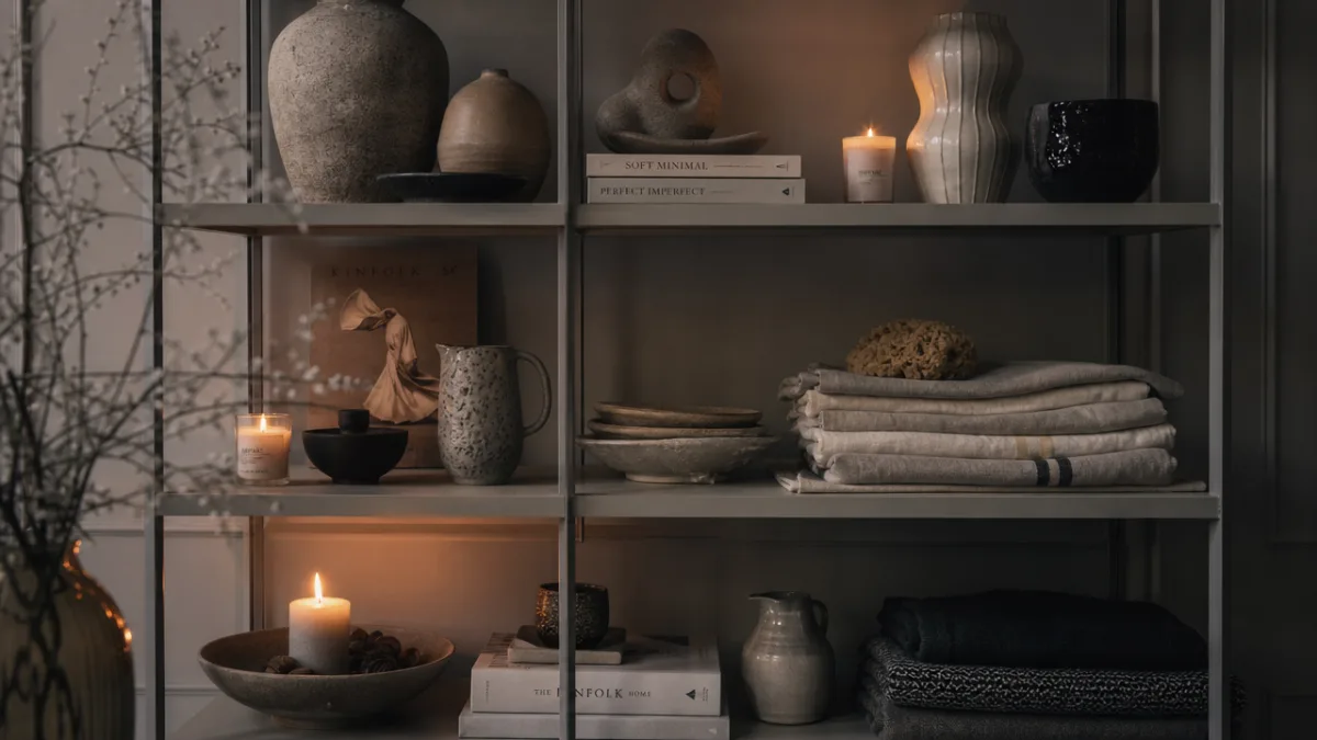
Even the most exquisitely designed packaging must ultimately perform in a retail environment where it competes for attention against dozens of other products. For a Copenhagen homeware brand, the retail context is likely to be a carefully curated independent boutique or a design-forward department store where the consumer is already attuned to quality and detail. In this setting, the candle collection should present as a complete, beautiful system — the individual candles reading as a family when displayed together, and each individual piece holding its own when a consumer picks it up and turns it over in their hands.
Display fixtures and point-of-sale materials are an extension of the packaging design conversation. A simple wooden tray with a light sand-blasted finish, or a set of white lacquered risers that allow the candles to be staggered at different heights, can dramatically enhance how the collection reads in a retail setting without competing with the packaging itself. Shelf talkers or small information cards describing the fragrance story of each candle — printed in the same typographic system as the packaging — give consumers the narrative context that helps convert browsers into buyers. Scent strips, if used, should be presented with the same care and restraint as the packaging: discreetly folded, simply labelled, entirely consistent in feel.
The unboxing experience, increasingly important as online retail continues to grow, deserves as much attention as the retail shelf presence. When a consumer receives a Copenhagen candle collection through the post, the outer shipping carton — even if it is a plain brown corrugated box — might be printed on the inside with a subtle brand message or botanical motif, creating a moment of delight at the point of opening. Tissue paper, a handwritten (or handwritten-style printed) note, and the candle itself nestled in a simple card tray all contribute to a sense that the brand has thought carefully about every moment of the consumer’s journey with the product, from first discovery to the final ember.
Touchpoints in the Consumer Journey
- Discovery: The consumer encounters the collection through a curated Pinterest board, an editorial feature, or a retail display — the visual coherence of the collection creates immediate recognition and desire
- First touch: Picking up the candle in-store, the consumer experiences the weight of the vessel and the tactile quality of the packaging surface — these physical cues communicate quality before any text is read
- Information gathering: The fragrance name, key notes, and brief brand story provide enough narrative to support the purchasing decision without overwhelming the clean aesthetic
- Purchase and unboxing: Whether bought in-store or online, the packaging continues to perform, making the act of receiving and opening the product feel like a small ceremony
- Ongoing presence: The vessel remains in the consumer’s home long after the candle has burned, acting as a daily reminder of the brand and a prompt for repurchase
The Legacy of Good Packaging Design
The best packaging design becomes inseparable from the product it contains. When consumers think of certain iconic candle brands, they think simultaneously of the scent and the vessel, the colour and the typeface — the whole object as an integrated experience. For a Copenhagen homeware brand investing seriously in its packaging design, the goal is to create something that occupies this kind of space in the consumer’s imagination: a packaging system so consistent, so well-crafted, and so true to the brand’s values that it becomes a recognisable presence in its own right, something people seek out specifically rather than simply encountering by chance.
Longevity is a key consideration in this context. Trend-chasing packaging might generate short-term excitement but risks dating quickly, forcing expensive redesigns every few seasons. A Copenhagen brand rooted in the enduring principles of Scandinavian design is better served by packaging that aims for a timeless quality — something that looks as right in a decade as it does today. This doesn’t mean the packaging should be boring or deliberately avoid the contemporary; it means that the design decisions should be driven by principles robust enough to outlast any particular aesthetic moment. Proportions, material quality, typographic clarity — these are the foundations of packaging that lasts.
Ultimately, great packaging design for a scented candle collection is an act of storytelling and hospitality. It tells the story of a brand, a place, a set of values, and a fragrance, all simultaneously and with economy of means. It welcomes the consumer into a world and makes them feel that they have made a thoughtful, rewarding choice. For a Copenhagen homeware brand, where design excellence is both a cultural inheritance and a commercial imperative, investing deeply in packaging design is not a luxury — it is the clearest possible expression of what the brand believes and who it is for. When the packaging is right, the candle almost sells itself.








What do you think?
It is nice to know your opinion. Leave a comment.