










Minimalist Simple Soy Candle Black White Label: The Art of Understated Elegance
The Rise of Minimalist Candle Design
We’re swimming in visual noise these days — bold patterns, competing color palettes, packaging that practically screams for attention. Which is exactly why the minimalist aesthetic has found such a devoted following in home décor. Candles, of all things, have become one of the clearest expressions of this shift. A simple soy candle with a clean black and white label taps into something that feels almost instinctive: that craving for calm in the middle of all the chaos, and the quiet satisfaction of finding beauty in restraint.
This wasn’t some overnight design revolution. Over the past decade, people have gotten a lot more intentional about what they bring into their homes. Candles aren’t just there to cover up smells or create a little ambiance anymore — they’re lifestyle choices, little wellness rituals, things that say something about who you are. When a candle sits on your coffee table or bathroom shelf, its label is doing a lot of the talking. A clean black and white label essentially says: the product is good enough to speak for itself. We’re not trying to distract you.
There’s a practical side to this too. Minimalist labels just photograph beautifully — they’re a natural fit for social media without feeling try-hard. They don’t go out of style. And they manage to appeal to a remarkably wide range of people, whether that’s a 24-year-old scrolling Pinterest for apartment inspo or a 45-year-old building out a calm, considered home office. That kind of quiet versatility is, somewhat paradoxically, one of the most powerful things a design can have.
What Makes Soy Wax the Preferred Choice
Choosing soy wax for a minimalist candle isn’t usually a coincidence — the two are genuinely philosophically matched. Soy wax comes from soybeans, so it’s natural, renewable, and biodegradable. It burns cleaner than paraffin, producing far less soot and releasing fewer nasties into the air. And here’s the thing: the kind of person drawn to a clean, minimalist aesthetic tends to also care about what they’re buying and where it comes from. A soy candle quietly satisfies both of those impulses at once. The label says “simple.” The material says “thoughtful.”
From a purely practical standpoint, soy wax is also just a better material to work with for artisan candle makers. Its lower melting point means it burns more slowly — a well-made soy candle can last 25 to 50 percent longer than a comparable paraffin one, which is a meaningful difference. It also holds fragrance really well, releasing scent gradually and evenly rather than hitting you over the head the moment you light it. That slow, steady scent throw feels like a perfect match for the whole unhurried, deliberate spirit of minimalist living.
There’s a community dimension here too. Most soybeans used in American-made soy candles are grown domestically, which means buying soy candles supports local farming communities and keeps the supply chain relatively short. As more and more people want to understand where their stuff comes from and how it was made, that kind of transparency genuinely matters. A simple black and white label on a soy candle quietly signals that someone thought carefully about the whole thing, from the raw material all the way to the finished product sitting on your shelf.

The Design Language of Black and White Labels
What makes a black and white label work is precisely what it refuses to do — it won’t compete for your attention. Color psychology research has long established that black reads as authoritative and elegant, while white communicates openness and clarity. Put them together and you get something that manages to be both bold and restrained at the same time. On a candle, that combination produces something that feels genuinely premium without being showy, personal without being sentimental, and contemporary without feeling cold or sterile.
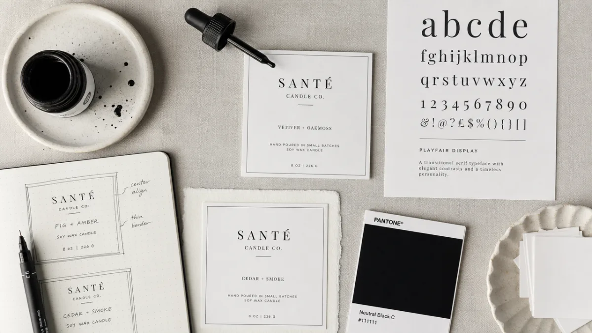
Typography ends up doing a lot of heavy lifting in this kind of design. When you’ve stripped out color and complex illustration, your font choices become everything. Most minimalist candle brands that really nail the look tend to work with clean sans-serif fonts, elegant serif typefaces, or a thoughtful pairing of both. The type needs to be legible, well-balanced, and genuinely beautiful on its own terms — because spacing, hierarchy, and alignment aren’t afterthoughts here, they basically are the design. A single well-chosen typeface with generous spacing can feel more luxurious than a label loaded with decorative flourishes and expensive finishes.
The physical label materials matter just as much as what’s printed on them. Matte paper has a soft, tactile quality that feels handmade and considered. Kraft paper nods toward natural, artisan production even within a strict black and white palette. Some designers bring in subtle textural details — a little embossing, some letterpress — that add depth without introducing color. All of this is a reminder that minimalism isn’t really about doing less. It’s about doing the right things, very deliberately, within a stripped-back framework.
Creating Your Own Minimalist Soy Candle Label
If you’re thinking about starting your own soy candle line with a minimalist black and white label, the most important place to start isn’t a design program — it’s with a clear sense of what your brand actually means. What’s the story you’re telling? Is it about slow living? A specific place or season? A collection of rare botanical fragrances? The sharper your concept, the more effective your minimalist label will be. Minimalism isn’t a shortcut around having a strong brand story; it’s just a very clean, very direct way of telling one.
Once you’re ready to get into the practical side of label design, there are a few key decisions to work through carefully. Your label has to include legally required information — fragrance ingredients, burn time, safety warnings, net weight — and fitting all of that onto a clean, minimal label is actually a real design challenge. A solution that works well for a lot of brands is splitting the job: a front label for brand identity, and a small back or bottom label for the product details. That way your primary visual stays uncluttered while you stay fully compliant. Consistent typography and clear hierarchy make even the fine print feel intentional.
Here are some practical guidelines worth keeping in mind if you’re designing a minimalist soy candle label for the first time:
- Stick to one or two complementary typefaces — more than that and things start to feel messy fast, which is exactly what you’re trying to avoid.
- Use professional design software like Adobe Illustrator or Canva Pro so your files are print-ready at the right resolution from the start.
- Always order sample prints before committing to a full run — colors and paper textures can look quite different in person than they do on your screen.
- Design with your specific vessel in mind, making sure the label proportions feel balanced and deliberate rather than like an afterthought.
- Test your label adhesive in warm and humid conditions, since candles often end up stored in bathrooms and kitchens where that can genuinely be a factor over time.
Printing quality is just as important as the design itself. Many boutique candle makers work with specialty print houses that offer short runs on premium paper stocks — a great option for small businesses that want a polished, professional result without committing to thousands of units. Online services have made this increasingly accessible, with options for matte, glossy, kraft, or clear labels in custom die-cut shapes. It’s always worth investing in quality printing. A beautifully designed label on cheap stock undermines everything you’ve worked to create.
Styling and Presenting Minimalist Soy Candles
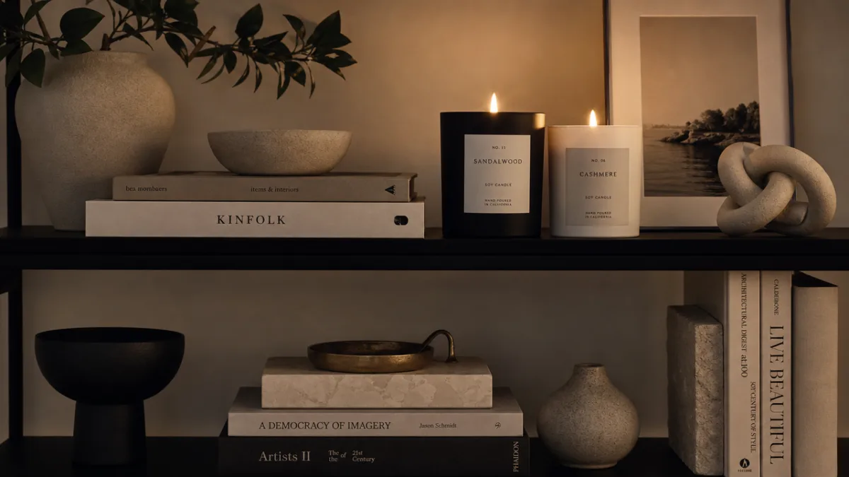
A minimalist soy candle with a black and white label might be one of the most genuinely versatile décor objects you can own. Its visual neutrality means it plays well with almost any interior style — Scandinavian simplicity, industrial, warm bohemian, you name it. The trick to styling these candles well is to lean into the same principles that make the aesthetic work in the first place: intentionality, negative space, and quality over quantity. One well-placed minimalist candle can anchor a whole little vignette more effectively than a cluster of mismatched accessories ever could.
Try grouping your candles in odd numbers and varying heights for visual interest that doesn’t feel overdone. A set of three in different vessel sizes — a short wide glass, a medium straight-sided jar, a tall slim cylinder — creates an arrangement that feels considered without feeling contrived. Pair them with just a couple of complementary objects: a small ceramic dish, a sprig of dried botanicals, a smooth stone. Keep the surface clean around them. The whole point is to create a little pocket of quiet beauty where the eye can actually rest.
For gifts, minimalist soy candles with black and white labels are genuinely hard to beat. They don’t need much extra packaging to feel special — a simple kraft box, a length of natural twine, or a slim white ribbon usually does it. Their gender-neutral look makes them appropriate for almost anyone, and the soy wax construction signals that real thought went into the gift. Whether it’s a housewarming, a birthday, a holiday, or just a “thinking of you” gesture, a beautifully labeled soy candle communicates care and good taste in exactly equal measure.
Building a Brand Around Minimalist Candle Aesthetics
For anyone thinking about starting a small candle business, the minimalist soy candle space is a genuinely interesting opportunity. The global candle market is worth billions and keeps growing, driven by all the consumer interest in home wellness, self-care, and thoughtful décor. Within that market, the premium artisan segment — which is exactly where minimalist soy candles with black and white labels live — is among the fastest-growing corners. Customers here are willing to pay more for products that feel considered, well-made, and genuinely aligned with their values.
Building a brand around a minimalist aesthetic really does require consistency across everything — and that’s both the challenge and the opportunity. Your label design needs to show up in your website, your social media, your packaging, your email newsletters, even the way you write. A brand that has gorgeous minimal candles but a chaotic, cluttered Instagram is sending a confusing message that will undercut your credibility. Every touchpoint should reinforce the same few core qualities: calm, clarity, quality, intention. That coherence is what builds the kind of trust that turns first-time buyers into long-term community members.
Pinterest in particular has become an essential tool for minimalist candle brands, and it’s easy to see why. The platform’s visual, aspirational nature is a natural home for clean product photography, lifestyle imagery, and curated mood boards. A single well-lit photo of a soy candle with a beautiful black and white label on a marble surface next to a ceramic mug and folded linen can rack up thousands of saves and drive real traffic to a website. The minimalist aesthetic is inherently Pinterest-friendly — the images are immediately appealing, easy to understand, and easy to want. The design philosophy ends up being its own most effective marketing strategy.
Sustainability, Community, and the Future of Minimalist Candles
The minimalist soy candle movement is really part of something bigger — a broad cultural shift toward more conscious, more intentional ways of buying and living. As people become more aware of the environmental impact of their choices, products that combine genuinely beautiful design with sustainable materials are in a strong position for the long haul. Soy wax, cotton wicks, recyclable glass vessels, plastic-free paper labels — these aren’t just marketing bullet points. They’re real commitments, and they resonate deeply with a growing segment of consumers. That clean black and white label signals to those shoppers that a brand actually shares their values.
The community dimension of the minimalist candle world is worth paying attention to too. Online spaces dedicated to candle making, home décor, and slow living are lively, engaged, and genuinely supportive places. Makers share label designs, fragrance combinations, and styling photos with a real enthusiasm that says a lot about how personally meaningful this craft has become for a lot of people. For small candle businesses, showing up authentically in those communities — sharing your process, inviting feedback, cheering on other makers — can be more valuable than any paid ad campaign. The minimalist aesthetic tends to draw people who value authenticity over spectacle, and those are exactly the customers worth building relationships with.
Looking ahead, the minimalist soy candle space will likely keep evolving alongside broader innovation in sustainable materials and production. We’ll probably see more seed paper labels that can be planted after use, refillable vessel programs that cut down on waste, and hyper-local fragrance collections inspired by specific landscapes or botanical regions. But through all of that, the core design language of the minimalist black and white label is likely to hold — because it speaks to something genuinely timeless. The human preference for beauty that doesn’t demand anything, for elegance that invites rather than insists, and for objects that earn their place in a thoughtful home through real quality and honest simplicity.








What do you think?
It is nice to know your opinion. Leave a comment.