










“`html
The Art of Decor: Transforming Spaces Into Stories
Interior decoration is one of the oldest and most personal ways humans express themselves. From cave paintings to carefully curated modern living rooms, we’ve always had this urge to shape our surroundings — to make them feel like us. Decor isn’t just about making things look pretty, though. It’s about creating spaces that actually feel good to be in, that lift your mood and quietly say something about who you are. Every choice you make, from the color you paint a wall to the throw pillow you toss on the couch, adds up to an atmosphere that people feel the moment they walk in — even before they can explain why.
The good news is that decorating has never been more approachable. Inspiration is everywhere — Instagram, Pinterest, design blogs, YouTube — and you don’t need a design degree to develop a real eye for what works. That said, having so many options can also feel paralyzing. Where do you even start? Getting comfortable with a few core principles — color theory, proportion, balance, texture, light — gives you a solid foundation to make decisions that feel intentional rather than like you’re just chasing whatever trend showed up in your feed this week.
This article digs into the many sides of interior decoration, with both ideas to get you inspired and practical advice you can actually use. Whether you’re moving into a new place, freshening up one room, or just trying to figure out why your living room never quite feels right, the principles here will help you approach decorating with more clarity and confidence.
Understanding Your Personal Style
Before you buy a single thing or pick up a paintbrush, the most valuable thing you can do is get honest with yourself about what you actually like. Personal style in decor isn’t about copying a magazine spread or nailing a specific aesthetic for the algorithm — it’s about figuring out which colors, textures, shapes, and moods genuinely speak to you. A simple way to start: collect images of spaces that make you feel something, whether that’s calm, cozy, excited, or inspired. Scroll through enough of them and patterns will start to emerge. Those patterns are your style.
There are plenty of established design styles to draw from — minimalism, maximalism, Scandinavian, bohemian, mid-century modern, industrial, coastal, farmhouse, and plenty more. Each one has its own visual language and emotional vibe. Minimalism is all about clean lines, open surfaces, and a restrained palette that makes a space feel quietly calm. Bohemian style goes the other direction entirely, piling on layered textiles, global influences, rich colors, and an abundance of plants and collected objects until a room feels warm, lived-in, and full of personality. Most people find they land somewhere between a few of these styles rather than fitting neatly into one box — and that’s completely fine. Knowing your general direction is what matters.
It’s also worth being realistic about how you actually live. Homes with young kids or pets need materials that can take a beating and be wiped down without a second thought. If you work from home, you probably want a workspace that feels clean and focused without taking over the whole living area. If you love hosting, you need seating that can flex between an intimate dinner party and a bigger crowd. A beautifully decorated space that doesn’t actually work for your life will frustrate you pretty quickly. The best rooms are the ones where good design and real practicality feel completely effortless together.
The Power of Color in Interior Decor
If there’s one tool in decorating that does more heavy lifting than anything else, it’s color. The right color choice can make a small room feel open and airy, a cold north-facing room feel warm and inviting, a chaotic space feel grounded, or a boring one suddenly feel full of life. Getting even a basic handle on color theory — how colors relate to each other, what saturation and value do, what emotional associations different hues carry — lets you use color on purpose instead of just guessing and hoping for the best.
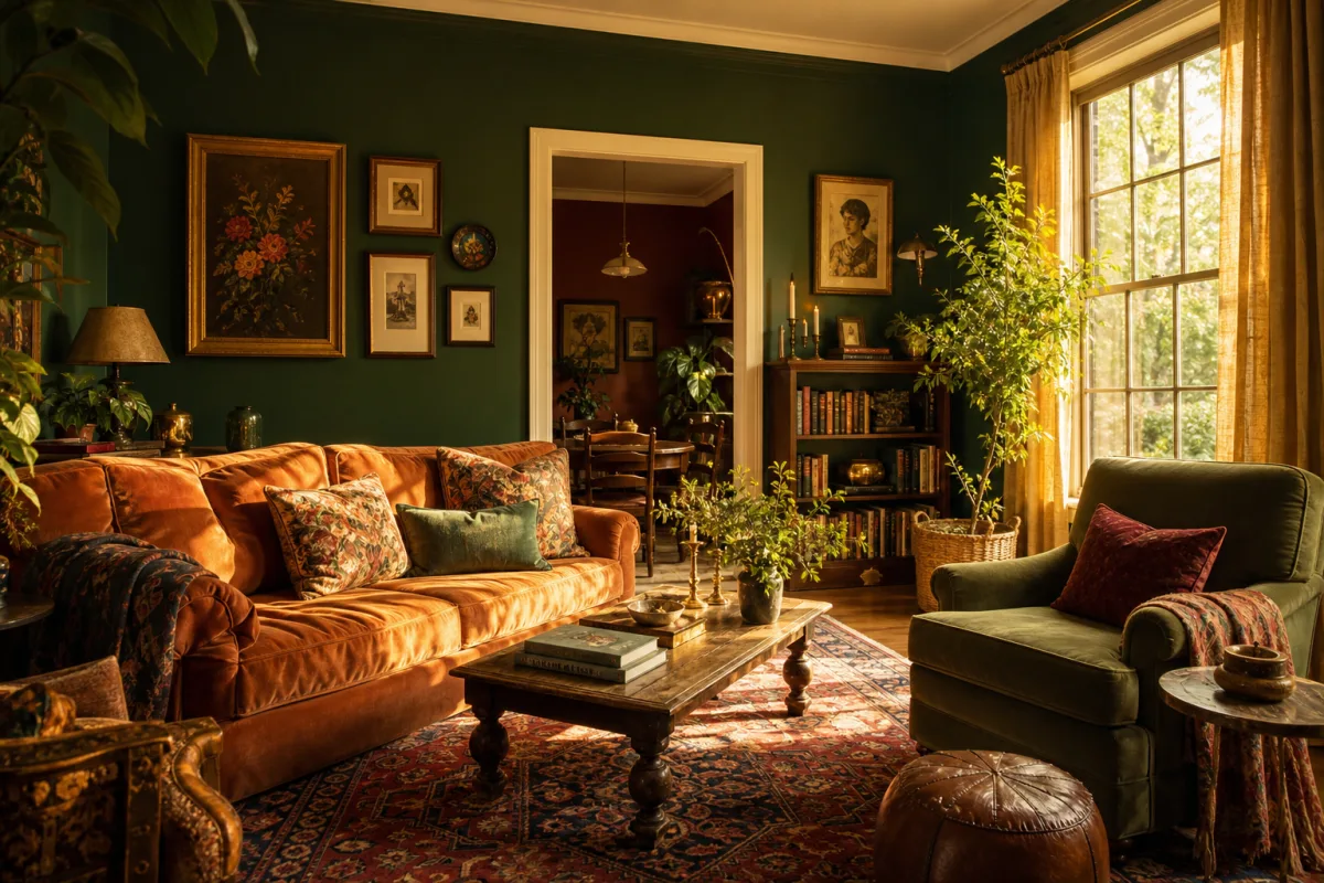
Warm colors like reds, oranges, and golden yellows visually advance toward you, making a space feel cozier and more energetic. They’re great in social spaces like living rooms, dining rooms, and kitchens where a bit of warmth and liveliness is exactly what you want. Cool colors like blues, greens, and violets do the opposite — they recede, making rooms feel bigger, calmer, and more serene. Think bedrooms, bathrooms, and home offices where you want to actually relax or focus. Neutral tones — whites, grays, beiges, earthy browns — are the versatile workhorses that let your furniture and accessories shine without competing for attention.
Beyond individual colors, how you combine them matters just as much. A monochromatic scheme uses different shades and tones of the same color for a look that feels polished and unified. A complementary scheme pairs colors from opposite sides of the color wheel — like navy and warm orange — for a bold, high-contrast effect that’s hard to ignore. An analogous scheme pulls from neighboring colors on the wheel, like soft greens, sage, and warm yellows, giving you something harmonious and naturally soothing. It’s always worth testing paint samples and fabric swatches in your actual space before committing — the lighting in your room will change everything, and what looked perfect on a screen can be a real surprise in person.
Furniture Selection and Spatial Arrangement
Furniture is the backbone of a room — it shapes how the space works and sets its whole visual tone. Picking the right pieces means balancing scale, proportion, style, comfort, and budget all at once, which is no small task when you’re staring down a sea of options at every price point. The one rule you really can’t break is scale: furniture has to fit the room. An oversized sectional will swallow a small apartment living room whole, and a dainty loveseat will look abandoned and sad in a large open-plan space. Measure your room before you shop, even if it’s just a rough sketch on the back of an envelope. It will save you so much time and so many headaches.
How you arrange your furniture is just as important as which pieces you choose. One of the most common mistakes people make is pushing everything against the walls, thinking it’ll make the room feel bigger. It actually does the opposite — the room ends up feeling sparse and disconnected, like a waiting room. Pulling furniture away from walls and orienting it toward a focal point or toward other pieces creates a sense of intimacy and intention that feels much more welcoming. Every room benefits from a clear focal point — a fireplace, a large piece of artwork, a great window — and everything else should feel like it’s in conversation with that anchor.
When it comes to buying furniture, it helps to think in two categories: investment pieces and accent pieces. Investment pieces — your sofa, your bed, your dining table, your main storage — should be bought for quality, durability, and staying power, because they’re expensive and disruptive to replace. Accent pieces — side tables, decorative chairs, lamps, objects — are where you can have fun, take risks, and follow trends without much long-term commitment. This approach gives a room something solid and enduring at its core while still leaving plenty of room for personality and evolution over time.
Lighting: The Element That Transforms Everything
Ask any professional designer what the most underestimated element in decorating is, and there’s a good chance they’ll say lighting. It’s easy to see why — you can have the exact same room, the same furniture, the same colors, and completely transform how it feels just by changing how it’s lit. Natural light is the ultimate goal. It’s flattering, it’s energizing, and it keeps a space feeling connected to the outside world. Getting as much of it as possible — with strategically placed mirrors, light-colored surfaces that bounce it around, and window treatments that don’t block it unnecessarily — should be near the top of your decorating priorities.
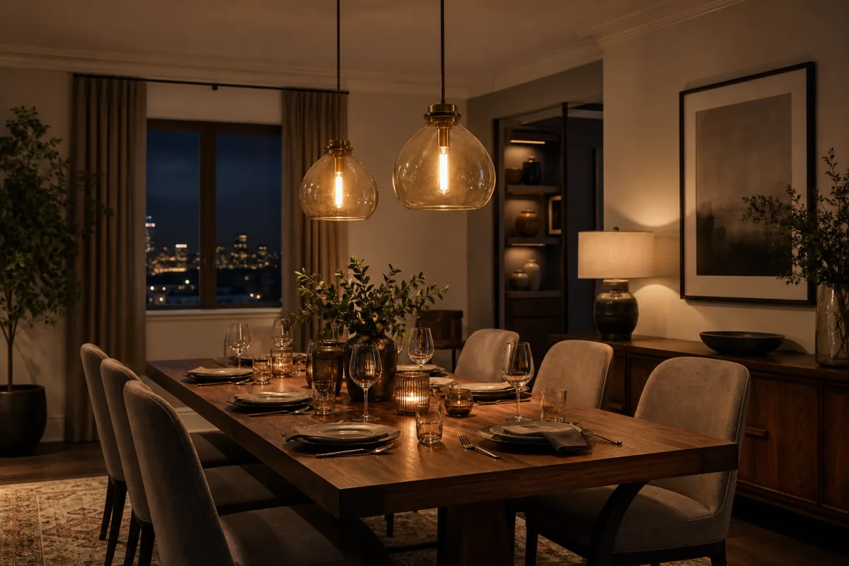
For artificial lighting, designers typically think in three layers: ambient, task, and accent. Ambient lighting is your baseline illumination — ceiling fixtures, recessed lights, large pendants that light the whole room. Task lighting is functional and specific: a desk lamp for reading, under-cabinet lights in the kitchen, a good vanity mirror in the bathroom. Accent lighting is the fun one — it’s used to highlight artwork, architectural features, plants, or any object you want to draw the eye to, adding depth and a little drama to the space. A good lighting plan uses all three layers and lets you control them separately, so you can dial in the right mood for a lazy Sunday morning versus a dinner party.
Color temperature is something a lot of people overlook, but it makes a huge difference in how a room feels. Warm white bulbs in the 2700–3000K range create that cozy, flattering glow that’s perfect for living rooms, dining rooms, and bedrooms. Cooler daylight bulbs in the 4000–5000K range are brighter and crisper, better suited to kitchens, home offices, and bathrooms where you actually need to see clearly. Mixing temperatures in the same space tends to create a visual discord that’s hard to put your finger on but immediately noticeable. And if you take one piece of advice from this section, let it be this: install dimmers. They’re inexpensive, easy to add, and they give you an almost magical amount of control over the feel of a room.
Textiles, Textures, and the Art of Layering
If color is the emotion of a room and furniture is its structure, textiles and texture are its soul. Rugs, curtains, cushions, throws, upholstery — these soft elements bring warmth, comfort, and a kind of visual complexity that hard surfaces simply can’t provide on their own. A room full of sleek, hard materials — no matter how beautiful — will feel cold and echoey. Bringing in natural textiles like linen, wool, cotton, jute, or velvet softens everything, absorbs sound, and creates the kind of environment that feels genuinely welcoming rather than just impressive to look at.
Learning to layer textiles is one of the things that most separates a put-together interior from one that looks flat or unfinished. The idea is to combine different materials, weights, and patterns in a way that feels rich and considered — but not cluttered. In a bedroom, that might mean a linen duvet layered with a chunky knit throw, a sheepskin at the foot of the bed, and a mix of cushions in different sizes and textures. In a living room, it could be a sisal rug with a softer wool rug layered on top, velvet cushions on a linen sofa, and curtains that pool slightly on the floor for that luxurious, effortless feel. The trick to keeping it from getting chaotic is to vary the textures and scales while sticking to a consistent color palette that holds everything together.
Texture isn’t just about soft furnishings, either. The contrast between smooth plaster and rough exposed brick, polished marble and raw timber, matte paint and glossy tile — these hard surface combinations create the kind of visual and tactile interest that makes a space feel genuinely alive. If a room feels a bit flat or one-note, ask yourself whether everything is too similar in surface quality. Introducing some contrast through materials and finishes is often the quickest fix. Nature is endlessly good at combining textures in ways that feel right, and it’s almost always a good idea to take your cues from there.
Art, Accessories, and the Finishing Touches
A room isn’t really finished until it’s been accessorized — and this is both the most personal part of decorating and, honestly, the part that goes wrong most often. Art, plants, books, ceramics, mirrors, candles, sculptures, things you’ve picked up on travels — these are the elements that turn a house into a home and make a room feel like it belongs to an actual person. They deserve just as much thought as any other part of the process, not a last-minute dash around a home goods store with whatever’s left in the budget.
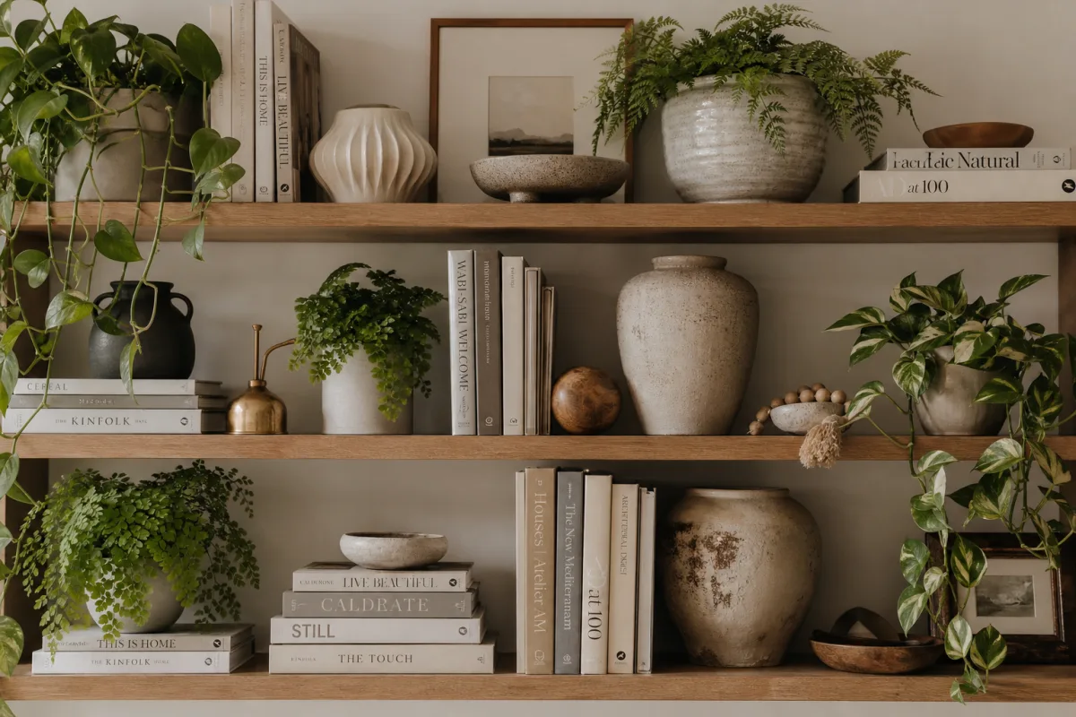
With artwork, scale is everything. A small print floating alone on a large wall looks lost and a little sad. Either go bigger, or build a gallery wall where multiple pieces come together to form a cohesive whole. Height matters too — most designers recommend hanging work so the center sits around eye level, roughly 57 to 60 inches from the floor. And when it comes to grouping objects, odd numbers tend to feel more natural and dynamic than even ones. Three things, five things, seven things — there’s something about that asymmetry that just works.
Plants deserve a special mention because they’re genuinely one of the most transformative and cost-effective things you can add to any room. They bring in natural color, organic shapes, movement, and actual life in a way nothing manufactured can replicate. A tall fiddle-leaf fig filling a corner with dramatic presence, a trailing pothos softening the edge of a shelf, a cluster of small pots on a sunny windowsill — plants connect interior spaces to the natural world and have real, documented benefits for mood and wellbeing. Even one well-chosen plant in a beautiful pot can shift the feel of a room in a way that’s hard to explain but immediately obvious. It’s genuinely one of the best decorating decisions you can make.
“`








What do you think?
It is nice to know your opinion. Leave a comment.