










Why Your Walls Deserve More Than Basic Frames
There is something quietly transformative about the way we choose to decorate our walls. For too long, the default approach has been to grab a basic frame from a discount store, slap a photo or print inside it, and call it done. But walls are the largest canvases in your home, and they carry an enormous amount of visual and emotional weight. The choices you make about what hangs on them — and how — can either elevate your entire living space or leave it feeling flat, uninspired, and oddly temporary, like you never fully moved in.
When interior designers talk about a room feeling “finished,” they almost always mean the walls have been thoughtfully considered. A sofa can anchor a space, a rug can define it, and lighting can transform its mood, but it is the walls that give a room its personality and tell the story of the person who lives there. Basic frames with mismatched matting, hung at awkward heights or without any intentional arrangement, undermine all the other beautiful choices you may have made in a room. Your walls are literally surrounding everything else — they deserve real attention.
This article is an invitation to rethink your approach to wall decor entirely. Whether you are starting from scratch in a new home, trying to refresh a space that has felt stale for years, or simply looking to add more meaning and visual interest to rooms you already love, there are strategies, materials, and ideas that go far beyond the basic frame. The goal is not to make your home look like a design showroom — it is to make it look unmistakably, beautifully like you.
The Problem with the “Basic Frame” Mindset
The basic frame mindset is not about the frames themselves — plenty of simple, elegant frames exist and serve a purpose — it is about the lack of intention behind the choice. When we default to whatever is cheapest or most convenient, we are essentially saying that the wall does not matter, that the art does not matter, and that the overall visual experience of the room is an afterthought. This approach tends to produce walls that feel like placeholders rather than statements, like someone meant to decorate and simply never got around to actually doing it.
Beyond aesthetics, there is also the issue of scale and proportion. Basic frames tend to come in standard sizes — 4×6, 5×7, 8×10 — and while these dimensions work fine for photograph albums, they often look miniature on a real wall. A single small frame hung in the center of a large expanse of wall creates what designers sometimes call a “floating postage stamp” effect: the piece looks lost, lonely, and somehow makes the wall look even emptier than it would if nothing were there at all. Sizing matters enormously, and it is one of the first things to reconsider when you move beyond basic.
There is also the question of what happens when a collection of basic frames is assembled without a cohesive vision. Mismatched frames in slightly different shades of black, wood, or silver, hung at inconsistent heights and spacing, create visual chaos rather than curated warmth. The eye does not know where to rest, the arrangement reads as accidental, and the overall effect is clutter rather than character. Moving beyond basic does not necessarily mean spending more money — it means spending more thought. And thought, as it turns out, is the most powerful design tool available to anyone.
Exploring Alternative Materials and Mediums
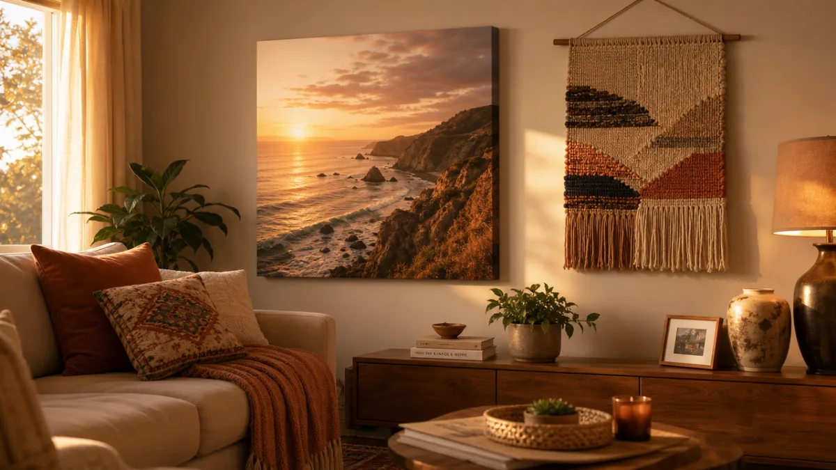
One of the most exciting ways to move beyond the basic frame is to explore art and decor in materials and mediums you may not have considered before. Canvas prints, for example, have a tactile, dimensional quality that flat framed prints simply cannot replicate. Because the image wraps around the stretcher bars, a canvas print has depth and presence on a wall — it projects slightly forward and creates its own quiet shadow, giving the piece a sense of life and weight. Gallery-wrapped canvases look particularly striking in large formats, where the image can breathe and dominate a wall in a way that feels intentional rather than accidental.
Metal prints are another medium worth exploring, especially in contemporary or industrial-style spaces. When an image is printed directly onto brushed aluminum or other metal substrates, the result has a luminous, almost backlit quality that makes colors pop with extraordinary vibrancy. Metal prints are also incredibly durable — they are waterproof, resistant to fading, and virtually impossible to damage through everyday handling. For kitchens, bathrooms, or any space where humidity or frequent contact might be a concern, metal prints offer both beauty and practicality in equal measure.
Beyond photographic reproductions, there is a vast world of wall art that does not involve printing at all. Woven tapestries bring texture and warmth to a wall in a way that no flat print can. Macramé pieces add bohemian softness and handcrafted authenticity. Reclaimed wood arrangements create sculptural interest and a connection to natural materials. Even something as simple as a collection of ceramic plates, hung in a carefully considered cluster, transforms a wall into something genuinely unique and full of personality. The medium you choose communicates something about you before anyone even looks at the subject matter of the piece itself.
The Art of the Gallery Wall
A gallery wall, done well, is one of the most powerful wall treatments available to a homeowner or renter. It takes the single-frame problem and solves it by creating a composition large enough to hold its own against any wall, while also allowing for personal expression through a curated mix of images, artwork, objects, and even three-dimensional pieces. The key word, though, is “curated.” A gallery wall without curation is simply a cluttered wall, and the difference between the two lies almost entirely in the intentionality of the arrangement and the visual logic that holds it together.
Successful gallery walls almost always share a few common elements. They have a unifying thread — whether that is a consistent color palette, a shared frame finish, a specific theme or subject matter, or a particular aesthetic sensibility like vintage, minimalist, or botanical. They are anchored by at least one dominant piece that serves as a visual center of gravity, around which the other elements are arranged. And they have deliberate spacing — not necessarily uniform spacing, but spacing that has been considered, tested, and adjusted until the relationship between each piece feels harmonious rather than arbitrary.
The planning process for a gallery wall does not have to be intimidating. One highly effective approach is to trace each frame or object onto kraft paper, cut out the shapes, and arrange them on the wall with painter’s tape before committing a single nail. This allows you to experiment freely with different configurations — symmetrical versus asymmetrical, tightly packed versus airy, horizontal versus vertical orientation — without any permanent consequences. Take photos of different arrangements, compare them, sleep on your favorite, and then hang. The extra hour of planning at this stage saves years of looking at a wall you wish you had done differently.
Considering Scale, Proportion, and Placement
Scale is arguably the single most important factor in wall decor, and it is the one most consistently underestimated by people who are new to thinking seriously about interior design. The human eye has an intuitive sense of proportion — we can feel, almost immediately, when something is the wrong size for its environment, even if we cannot always articulate why. A piece that is too small for a wall creates unease. A piece that is appropriately large or even slightly larger than you initially feel comfortable with tends to feel anchored, confident, and right.
As a general guideline, artwork hung above a sofa or other piece of furniture should span roughly two-thirds to three-quarters of the width of that furniture. So if your sofa is six feet wide, the art or arrangement above it should ideally be between four and four and a half feet wide. This creates a visual relationship between the furniture and the wall decor that feels intentional and balanced. The same principle applies to art hung above a bed, a console table, or a fireplace mantel. The art should feel like it belongs with the furniture beneath it, not like it wandered there by accident.
Height is equally important and equally often ignored. The standard guidance from designers and museum professionals alike is to hang art so that its center is approximately 57 to 60 inches from the floor — roughly eye level for the average person standing in the room. This rule exists because art hung too high is physically difficult to engage with; you are essentially craning your neck to look at something that was meant to be experienced at eye level. When a grouping of pieces is involved, treat the grouping as a single unit and aim to center the entire arrangement at that same 57 to 60-inch mark, adjusting for the specific room and how people primarily experience it — seated versus standing.
Using Color and Contrast Strategically
Color is one of the most powerful tools in wall decor, and using it strategically can completely transform the way a room feels. Art that shares colors with the surrounding furnishings and textiles creates a sense of cohesion and intentional design. Art that deliberately contrasts with the wall color creates drama and draws the eye. Neither approach is inherently better — the choice depends on the mood you are trying to create and the existing palette of the room. What matters is that the relationship between the art’s color and the room’s color is chosen rather than accidental.
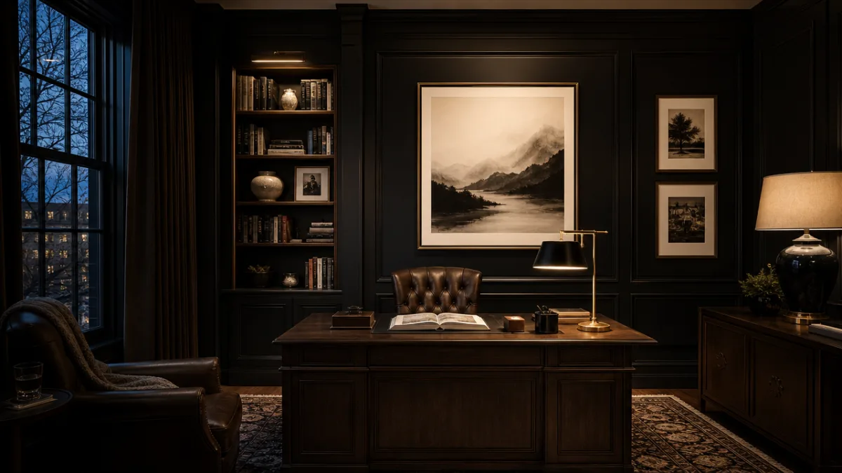
Dark walls have become increasingly popular in interior design, and for good reason — they create a cocooning, intimate effect that lighter walls simply cannot achieve. On a dark wall, lighter artwork tends to float forward dramatically, creating a sense of illumination and contrast that can be breathtaking. Conversely, art with deep, saturated colors tends to recede slightly on a dark wall, creating a layered, moody effect that feels more immersive than striking. Understanding how your wall color interacts with the art you hang on it allows you to make choices that enhance both the wall and the piece.
Matting — the border between the artwork and the frame — is another color decision that many people overlook. White or cream matting is the classic choice, and it works beautifully in most contexts because it creates a visual buffer that separates the art from its surroundings and draws the eye inward. But colored matting, when chosen thoughtfully, can do extraordinary things. A deep navy mat on a botanical print, a blush mat on a black-and-white photograph, or a sage mat on a watercolor landscape can all transform a relatively ordinary piece into something that feels considered and elevated. The mat is not just padding — it is part of the composition.
Incorporating Texture and Three-Dimensional Elements
Flat art on flat walls creates a visual experience that is, by definition, two-dimensional. To create walls that feel truly alive and dynamic, texture and three-dimensional elements are essential. Texture catches light differently at different times of day — something that appears subtle in afternoon sun may cast fascinating shadows in evening lamp light. This quality of changing throughout the day gives a wall a kind of quiet life, making the same room feel subtly different at different hours, which is one of the hallmarks of truly sophisticated interior design.
There are many ways to introduce texture and dimension to your walls without undertaking a major renovation. Wooden wall panels or shiplap can be added to a single accent wall to create warmth and architectural interest. Floating shelves allow you to combine two-dimensional art with three-dimensional objects like plants, ceramics, books, and sculptural pieces, creating a layered vignette rather than a flat arrangement. Wicker and rattan mirrors add organic texture while also bouncing light around the room. Even a single piece of raised or textured art — an oil painting with visible brushwork, a relief sculpture, a shadow box frame with depth — introduces dimension that a flat print cannot.
Plants deserve special mention as wall decor elements that are too often overlooked. Wall-mounted planters, trailing plants on floating shelves, or even a living plant wall can transform a bare surface into something genuinely extraordinary. Plants bring color, texture, movement (as they grow and change), and life to a wall in ways that no manufactured decor can fully replicate. They also improve air quality and have been shown to reduce stress and increase feelings of wellbeing — benefits that your collection of basic frames, however lovingly assembled, almost certainly cannot claim.
Personalizing Your Walls with Meaning and Memory
All of the technical considerations — scale, proportion, material, color, texture — ultimately serve one deeper purpose: creating walls that feel personally meaningful to the people who live with them. A home decorated according to all the correct principles but filled with art chosen purely for its aesthetic qualities can feel oddly impersonal, like a well-designed hotel rather than a lived-in home. The most beautiful walls are almost always those that contain something irreplaceable — a photograph from a moment that mattered, a piece of art made by someone you love, an object collected during a trip that changed you.
This does not mean that every piece on your wall needs to carry profound sentimental weight. It means that some pieces should, and that those anchor pieces give the room its soul. Around them, you can arrange art chosen purely for beauty, prints picked up at a market, or objects collected for no reason other than that they delighted you in the moment. But the anchor pieces — the ones that could not be replaced because they are yours alone — are what transform a decorated wall into a story, and a house into a home.
Consider also the act of rotation and evolution. Your walls do not need to be permanent. Many people feel that once art is hung, it must stay there forever, and this mindset leads to living with pieces that no longer resonate simply to avoid the inconvenience of change. But walls that evolve — that reflect who you are becoming rather than only who you were — are walls that continue to engage and inspire over time. Seasonal rotations, new acquisitions from local artists, pieces moved from room to room as your taste and your life change: all of these keep your walls feeling alive and current, which is perhaps the most important quality a wall can have.

Practical Steps for Transforming Your Walls Today
Knowing that your walls deserve more is one thing; knowing where to start is another. The gap between inspiration and action is where most wall decor ambitions stall, often because the project feels overwhelming when viewed as a whole. The most effective approach is to break it into stages, beginning with assessment. Walk through each room of your home and look at the walls as if you were seeing them for the first time. Notice what is working, what feels dated or arbitrary, what walls feel empty, and what walls feel cluttered. Make notes. Take photographs. Give yourself the perspective of a visitor rather than a resident.
Once you have assessed the existing situation, set priorities. Not every wall needs to be transformed at once, and trying to tackle everything simultaneously is a recipe for abandoned projects and buyer’s remorse. Instead, identify the one or two walls that would have the greatest impact if improved — typically the first wall you see when entering a room, or the wall that serves as the backdrop for the room’s most important activity. Start there, do it thoughtfully and well, and let the success of that project fuel your motivation for the next one. Incremental progress with intention produces better results than wholesale change without it.
Budget is a real consideration, and it is worth knowing that beautiful walls do not require unlimited funds. Local art fairs, thrift stores, estate sales, and online print shops offer extraordinary options at every price point. Supporting local artists is both affordable and deeply satisfying — you get original work with a story, and you contribute directly to the creative life of your community. Framing is often the most expensive part of displaying art; learning basic framing skills, shopping at discount framing retailers, or repurposing beautiful vintage frames from secondhand shops can dramatically reduce costs without sacrificing quality or style.
Resources and Inspiration for the Journey Ahead
The internet has made it easier than ever to find inspiration for wall decor, but it has also made it easier to feel overwhelmed by the sheer volume of possibilities. Platforms like Pinterest are invaluable for collecting images that resonate with you, but they work best when you use them actively rather than passively — not just saving everything that catches your eye, but pausing to notice what the images you love have in common. Do you consistently save rooms with dark walls and bold art? Rooms with light, airy gallery walls? Rooms with single large-scale pieces? The patterns in your own saved collections reveal your genuine taste more accurately than any style quiz could.
Beyond digital platforms, visiting actual spaces — museums, galleries, well-designed restaurants and hotels, showrooms, and the homes of friends with great taste — offers a kind of sensory education that no screen can fully replicate. You learn about scale by standing in front of a large canvas. You learn about texture by running your hand along a woven piece. You learn about light by watching how a room changes from morning to evening. Design is a physical, embodied discipline, and the more you seek out beautiful, thoughtfully designed spaces in the real world, the more fluent you become in the visual language of interior decoration.
Ultimately, the journey toward walls that truly reflect who you are is one without a final destination. Taste evolves, lives change, new art is discovered, and rooms shift in function and importance. The goal is not to achieve a perfect, finished state — it is to develop a practice of paying attention to your walls, taking them seriously as the frames of your daily life, and continuing to make choices that honor both the space and the person living in it. Your walls have always deserved more than the basic frame. Now you have the tools, the permission, and the inspiration to give them exactly that.








What do you think?
It is nice to know your opinion. Leave a comment.