










“`html
Textured Leaf Painting: A Complete Guide to Creating Stunning Nature-Inspired Art
Textured leaf painting is one of those art forms that manages to be both approachable and genuinely impressive at the same time. Whether you’ve been painting for years and want to try something new, or you’re a total beginner looking for a way in, working with leaves and texture opens up a whole world of creative possibilities. And the best part? Nature basically hands you an endless supply of shapes and patterns to work with — the results are almost always beautiful.
What really sets this style apart is the tactile dimension it brings to a painting. Texture pulls viewers in — it makes them want to reach out and touch the surface. When light skims across the raised ridges of a leaf impression or catches the bumps of a mixed-media surface, something comes alive in the piece that a flat painting simply can’t replicate. That’s exactly what makes textured leaf paintings so striking on walls at home, in galleries, or in any creative space.
In this guide, we’ll walk through the whole process from start to finish — gathering materials, choosing your leaves, mastering the painting techniques, and getting your work looking polished and finished. By the time you reach the end, you’ll have everything you need to start making pieces that genuinely celebrate the beauty of the natural world.
Understanding the Art of Textured Leaf Painting
Before we get into the practical side of things, it’s worth taking a moment to understand what textured leaf painting actually is and where it comes from. At its core, the technique uses real leaves — as stamps, stencils, or embedded materials — combined with texture-building mediums to create layered, dimensional artwork. Leaves can be pressed directly into wet paint or medium, used to transfer their vein and edge patterns onto a surface, or painted over to leave their imprint behind.
The tradition of using natural elements in art goes back thousands of years, from cave paintings made with plant pigments to the botanical illustrations of the Renaissance and the leaf-print textiles of East Asia. Modern textured leaf painting draws from all of that history while bringing in contemporary materials like acrylic gel mediums, modeling paste, and mixed media techniques. It’s an art form that feels both ancient and very much of the moment — rooted in nature but wide open to personal interpretation.
It also helps to know upfront that there’s no single “right” way to approach this. Some artists plan everything carefully — deliberate leaf placement, a mapped-out color palette, the whole thing. Others work more intuitively, letting the composition develop as they go. Both approaches work beautifully, and most artists end up moving between the two depending on what a particular piece calls for.
Gathering Your Materials and Choosing the Right Leaves
The first practical step is getting your materials together. You don’t need to spend a lot to get started, but a few quality items will make a noticeable difference. For beginners, a basic setup might include a stretched canvas or heavy watercolor paper, some acrylic paints, a palette knife, and a tube of acrylic texture medium or molding paste. As you get more experienced, you might start adding heavy gel medium, fine sand, natural fibers, or even gold leaf to your toolkit.
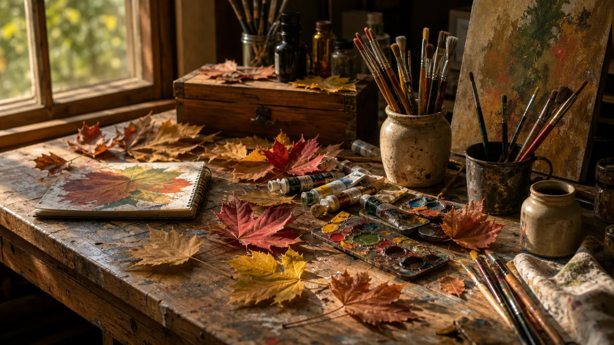
Choosing your leaves is honestly one of the most enjoyable parts of the whole process. Not all leaves work equally well for painting, though. You want ones with strong, clearly defined veins — those are what create the most interesting impressions and textures. Leaves with distinctive silhouettes are also a big plus: think oak, maple, fig, or magnolia. They give your compositions dynamic shapes to build around. Steer clear of very thin or dry leaves, since they tend to tear or fall apart before you can really use them.
When you’re out collecting, grab a variety of sizes and shapes so you have plenty of options when you sit down to compose. Fresh leaves are generally the easiest to work with since they’re more flexible, though lightly pressed leaves can produce lovely results too. Store your collection between sheets of paper and press them gently under a heavy book if you’re planning to use them as stamps or prints rather than embedding them in texture medium. Having more than you think you need means you can experiment freely without rationing your best finds.
- Oak leaves: Bold lobed shapes with strong central veins, ideal for dramatic focal points in larger compositions.
- Maple leaves: Symmetrical and iconic, they create instantly recognizable prints with fine detail in the veining.
- Fig leaves: Large and architectural, these work beautifully as statement pieces in minimal compositions.
- Eucalyptus: Long, slender leaves with subtle texture, excellent for creating rhythm and movement across a canvas.
- Fern fronds: Complex and highly detailed, these add intricate pattern and a delicate, lacy quality to any piece.
- Monstera: The distinctive split leaf silhouette makes a graphic, modern statement in any painting.
Preparing Your Surface and Building Texture
Surface preparation is something a lot of beginners skip past, but it really does matter. If you’re working on canvas, start with a layer of gesso and let it dry completely. This gives the surface a slightly rough tooth that grips your texture medium and paint far better than bare canvas ever would. If you’re using a wood panel, sand it smooth first before applying gesso — otherwise the wood grain can interfere with the texture you’re trying to create.
Once your surface is primed, it’s time to build the foundational texture that will anchor your leaf designs. This is where modeling paste, heavy gel medium, and textured gesso really shine. Use a palette knife to spread your chosen medium across the canvas in broad, confident strokes. Don’t aim for perfect evenness — variations in thickness are actually what create depth and interest. You can also drag a comb or fork through the wet medium to make deliberate patterns, or press a crumpled piece of plastic wrap against the surface for a more organic, random texture.
At this stage, you can press fresh leaves directly into the wet medium. Push them gently but firmly so they make full contact, then carefully peel them away to reveal the impression of their veins and edges. Alternatively, you can leave the leaves embedded in the medium and let everything dry together before painting over the top — this creates a slightly more three-dimensional result where the leaves are preserved within the layers. Both methods produce great results, and trying both will help you figure out which approach feels more like yours.
Drying time for texture medium varies depending on the product and how thickly you’ve applied it, but as a general rule, give it at least four to six hours before adding paint. Thick applications may need overnight. Painting over medium that hasn’t fully cured can cause cracking, lifting, or muddy colors — patience at this stage really does pay off. You can use a fan or hairdryer on a low setting to speed things up slightly, though for very thick applications, letting it air dry naturally is the better option.
Painting Techniques and Color Application
With your textured surface ready and fully dry, you’ve reached the most expressive and enjoyable part of the whole process: putting color on. How you approach color in a textured leaf painting will depend a lot on the effect you’re going for. Some artists stick to a tonal, near-monochromatic palette and let the texture itself do the talking, using subtle variations of a single color to build depth and shadow. Others go bold with rich, saturated hues that really celebrate the vivid colors of foliage through different seasons.
Dry brushing is one of the most effective techniques for textured surfaces. You load a stiff brush with a small amount of paint and drag it lightly across the raised texture — because the paint only catches the highest points, you get a beautiful contrast between the highlighted ridges and the darker recesses below. Working from dark to light tends to give the best results: start with a thin dark base color across the whole surface, let it dry, then gradually build up lighter values with the dry brush.
Washing is another technique that works particularly well here. A wash is a highly diluted mix of paint and water that flows freely across the surface and pools naturally in the lower recesses, creating shadow and depth without you having to think too hard about it. Alternating between washes of different colors — warm and cool, light and dark — builds up a richly layered surface with a luminous, almost glowing quality. Combining dry brushing and washing is one of the most versatile approaches available, and it’s worth spending time getting comfortable with both.
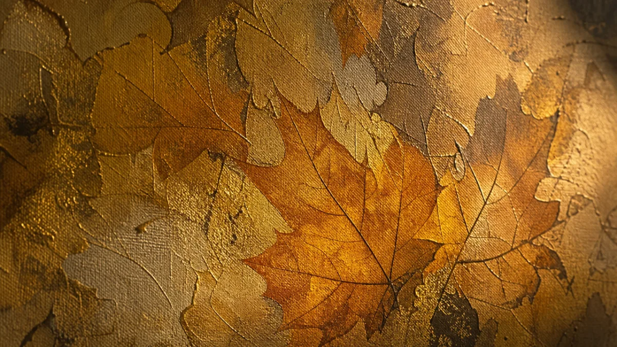
Don’t underestimate what metallic paints and powders can do for a textured leaf painting either. Gold, copper, and bronze tones catch beautifully on textured surfaces, adding warmth and a sense of luxury to botanical subjects. Try applying a thin wash of gold metallic paint over a dried textured surface, then wiping most of it off with a cloth — what’s left behind in the deepest recesses and on the highest ridges creates a subtle shimmer that can completely transform a piece. Silver and iridescent paints do something similarly magical in cooler, more contemporary palettes.
Composition and Design Principles for Leaf Paintings
Strong composition is what separates a painting that really works from one that’s just technically competent, and it’s worth thinking this through before you pick up a brush. The rule of thirds is a solid starting point: imagine your canvas divided into a grid of nine equal rectangles by two horizontal and two vertical lines, and try to place your most important elements near the points where those lines intersect. It creates a sense of dynamic balance that feels natural without being stiff or predictable.
When you’re working with multiple leaf impressions or prints, think about rhythm and repetition. Repeating the same leaf shape at different scales and orientations creates a visual rhythm that carries the eye across the painting. Varying the spacing — clustering some elements together and giving others more room — creates areas of visual activity and rest that make the whole composition feel alive rather than static. Think of it a bit like music: you need both the busy passages and the quieter moments for the piece to breathe.
Negative space is another tool that beginners often underuse. The relatively empty areas of your painting aren’t dead space — they’re actively contributing to the design, giving the eye somewhere to rest and making the busier elements feel more emphatic by contrast. A single beautifully textured leaf impression floating in a generous, subtly colored background can hit harder than a canvas crammed with competing elements. Learning to edit your compositions and resist the urge to fill every inch of the surface is genuinely one of the most important skills you can develop as a painter.
- Begin with a thumbnail sketch: Before touching canvas, sketch several small compositional options in a notebook to explore different arrangements.
- Establish a focal point: Decide which leaf or group of leaves will be the dominant visual element and ensure everything else in the composition supports rather than competes with it.
- Consider the edge: How your composition meets the edges of the canvas affects the overall sense of space and energy — some elements can be cropped at the edge for dynamism.
- Balance visual weight: Larger, darker, and more detailed elements carry more visual weight; distribute these thoughtfully across your composition to maintain balance.
- Step back regularly: View your work from a distance as you go, and take photographs of it to see the composition fresh through the camera lens.
Finishing, Protecting, and Displaying Your Work
Once your painting is complete and thoroughly dry, finishing it properly is what ensures it stays looking great for years to come. Start by applying a varnish or protective sealant over the entire surface. For acrylic paintings, a purpose-made acrylic varnish is the way to go. These come in matte, satin, and gloss finishes, and each one gives the painting a noticeably different final look. Matte varnish creates a soft, gallery-style finish that doesn’t reflect light and lets the textures read clearly. Gloss adds depth and richness to colors but can create distracting reflections depending on your lighting.
Before you varnish, make sure the painting is completely dry and dust-free. Apply the varnish in thin, even coats using a wide, soft brush, working in one direction and not going back over areas you’ve already covered. Two to three thin coats will protect the surface better than one thick one, and letting each coat dry properly between applications really matters. If you’ve used metallic elements anywhere in the painting, test the varnish on a small inconspicuous area first — some varnishes can subtly shift the look of metallic finishes.
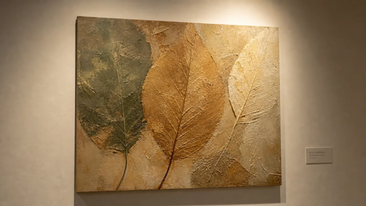
How you display a textured leaf painting can make or break the impact it has in a space. Because texture is so central to these pieces, lighting is crucial. Raking light — coming from the side at a low angle rather than straight on — casts small shadows across the raised areas and makes the three-dimensional quality of the work really come alive. A small adjustable picture light or a directional spotlight placed to one side of the painting does this beautifully, and the effect can change quite dramatically at different times of day as the natural light shifts.
It’s also worth thinking about the context your painting will live in. Textured leaf paintings work across a surprisingly wide range of interior styles — the natural warmth of a Scandinavian-inspired room, the layered richness of a maximalist space, pretty much anything in between. Earthy, autumnal pieces tend to feel at home in living rooms and dining spaces, while cooler, more minimal compositions can work beautifully in bedrooms or home offices. If you’re creating work to sell or give as a gift, offering it unframed gives the recipient the most flexibility, or go with a simple floating frame that doesn’t compete with the natural qualities of the painting itself.
Developing Your Practice and Finding Your Style
Like any creative practice, textured leaf painting really rewards regular experimentation. The more you work, the more you’ll discover about which techniques, materials, and palettes feel most like you. Keep a dedicated sketchbook or journal where you test new ideas, jot down color combinations that clicked, and stick in samples of texture experiments. Over time this kind of visual diary becomes genuinely invaluable — you can flip back through it and actually see how your practice has evolved, which is both useful and encouraging.
One of the best ways to deepen your understanding of this art form is to actively look at work that inspires you. Study how botanical illustrators handle the details of leaf structure, how abstract painters use texture to create emotional impact, how artists across different traditions and centuries have used natural motifs. This kind of looking isn’t about copying anyone — it’s about developing the visual literacy to make deliberate, informed choices in your own work and understanding just how wide the range of possibilities really is.
Community matters too, more than you might expect. Joining a local art group, taking part in online painting challenges, or simply sharing your work on social media and engaging with other artists working in similar ways can provide feedback, encouragement, and fresh perspectives that are genuinely hard to generate on your own. The textured and botanical painting community online is particularly warm, with artists at all levels sharing their processes openly and offering real encouragement to people who are just finding their feet.
And finally — the goal here isn’t perfection. It’s growth, expression, and honestly just enjoying the process. Some of the most beautiful textured leaf paintings contain what their makers initially thought were mistakes: a color that spread in an unexpected direction, a leaf impression that landed at an odd angle, a wash that pooled somewhere surprising. Learning to work with the unexpected rather than against it is one of the real gifts of a regular painting practice. The natural world that this whole art form is rooted in is itself full of beautiful imperfection — and that’s precisely what makes it worth painting.
“`








What do you think?
It is nice to know your opinion. Leave a comment.