










How to Paint With Sharpies and Alcohol: A Complete Guide to Stunning Ink Art
Introduction to Sharpie and Alcohol Art
If you’ve never tried Sharpie and alcohol painting before, you’re in for a treat. It’s one of those rare art techniques that’s genuinely accessible to beginners while still being deep enough to keep experienced artists hooked. The basic idea is simple: you combine permanent markers with rubbing alcohol to create effects that look almost like watercolor — vivid, fluid, and full of happy surprises. Tie-dye swirls, dreamy abstract washes, radial bursts of color — none of it would be easy to pull off with a brush and paint, but with this method, it almost happens on its own.
What makes this so appealing is how little you need to get started. No expensive supplies, no formal training, no intimidating setup. Just a few Sharpies, some isopropyl alcohol, and a surface to work on. The alcohol dissolves the marker ink and sends it spreading outward in ways that genuinely feel like magic the first time you watch it happen.
It’s no surprise the technique blew up on Instagram and Pinterest — those time-lapse videos of ink blooming across a tile are mesmerizing to watch. And the applications are surprisingly wide: you can decorate a ceramic mug, create wall art on canvas, or customize a pair of sneakers. This guide covers everything you need to get going, from picking up your first supplies to finishing and protecting the work you make.
Materials and Supplies You Will Need
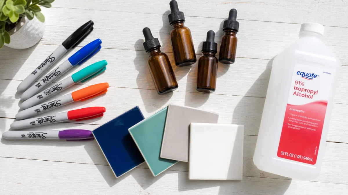
The most important thing in your supply kit is, obviously, the markers. Sharpies in particular work great for this because they’re packed with dye-based ink that reacts beautifully with alcohol — it spreads and blooms in these rich, saturated ways that cheaper markers just don’t quite match. Fine-tip Sharpies are handy for detail work, while broad or chisel tips let you lay down a lot of color fast, which is great when you’re covering bigger areas.
Next up is isopropyl rubbing alcohol, which you can grab at any pharmacy or grocery store. The concentration actually matters quite a bit here. A 70% solution spreads ink more slowly and gently, which gives you more control over blending. Jump up to 91% or 99% and the alcohol gets more aggressive — it pushes ink farther and faster, creating bigger, more dramatic effects. A lot of artists keep both on hand and switch depending on what a piece calls for.
Beyond that, you’ll need a surface and something to apply the alcohol with. Good surface options include watercolor paper, ceramic tiles, canvas, and Yupo paper — a smooth, synthetic sheet that produces some of the most vivid results you’ll ever see with this technique. For applying alcohol, cotton swabs, droppers, small spray bottles, and paintbrushes all work, and each one gives you a different look. Honestly, experimenting with different tools is half the fun. Here’s a quick rundown of the essentials to gather before you start:
- Sharpie permanent markers in a variety of colors
- Isopropyl rubbing alcohol (70%, 91%, or 99% concentration)
- A working surface such as Yupo paper, ceramic tile, canvas, or watercolor paper
- Cotton swabs and cotton balls
- Pipettes or droppers for precise alcohol application
- A small spray bottle for misting large areas
- Gloves to protect your hands from ink staining
- A well-ventilated workspace or outdoor area
Preparing Your Workspace and Surface
Taking a few minutes to set up properly before you dive in makes a real difference. The most important thing is ventilation — isopropyl alcohol fumes are irritating and can be genuinely harmful in a closed-up space, so crack a window, work outside, or at least get a fan moving some air around. Gloves are also worth putting on before you start, because Sharpie ink will stain your skin deeply and stubbornly if you give it the chance.
Protect whatever is underneath your work, too. Lay down a plastic sheet, a silicone mat, or a thick stack of newspaper, because Sharpie ink will bleed right through paper and onto your table if you let it. Keep paper towels or a rag nearby for quick cleanups, and have a bit of dish soap and water on hand just in case ink gets on your skin and you need to wash it off before it sets.
How you prep the surface itself depends on what you’re working on. Ceramic or glass should be wiped down with alcohol first to remove any oils or residue that could keep the ink from bonding properly. On canvas, some artists like to brush on a light coat of rubbing alcohol before they start, which helps colors spread more evenly across the texture. Yupo paper, on the other hand, needs nothing at all — its smooth, non-porous surface is ready to go straight out of the package and tends to produce the most fluid, vivid results of any surface.
Basic Techniques for Beginners
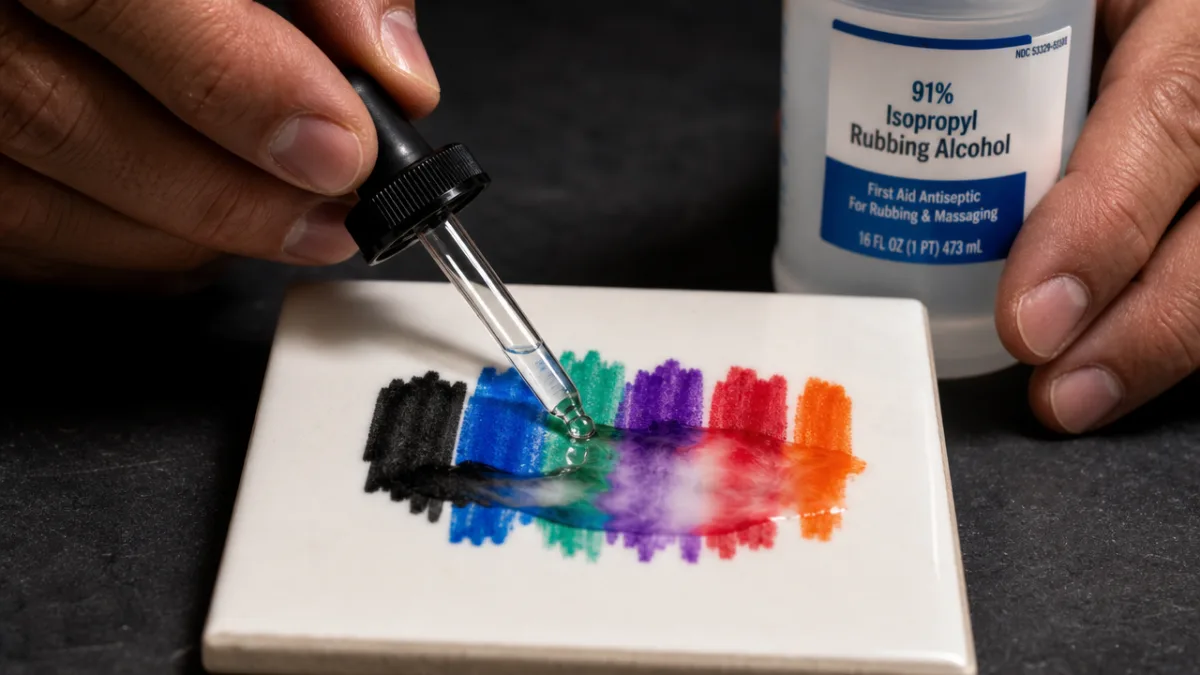
With your workspace ready and supplies in front of you, it’s time to actually make something. The most fundamental move in this whole technique is called drop and spread. Color a generous blob of ink onto your surface with the Sharpie, then take a dropper or alcohol-dipped cotton swab and put a drop of alcohol right in the center of it. The ink instantly gets pushed outward in a radial burst — like a flower or a starburst — and that moment is genuinely thrilling every single time. That reaction is the heart of everything this technique can do.
A great first project for beginners is a simple color-blending experiment on a ceramic tile. Put down a few different Sharpie colors in overlapping patches, then mist the whole surface lightly with alcohol from a spray bottle. The colors will start flowing and blending into each other, making soft gradients and color combinations you didn’t plan for. You can tilt the tile to nudge the ink in a particular direction, or use a cotton swab to gently push things around while it’s still wet. It’s a low-pressure way to get a feel for how the materials behave.
Another beginner-friendly approach is the wet-on-wet technique. Rather than applying ink first, you wet the surface with alcohol and then immediately draw into it with your Sharpie. The ink spreads the instant it touches the wet surface, giving you soft, diffused lines that are great for atmospheric backgrounds. Once you’re comfortable with these basics, you can start layering — letting a first layer dry completely before adding more ink and alcohol on top — which opens up a lot more depth and complexity.
- Drop and Spread: Apply ink in a concentrated spot and drop alcohol into the center to create radial burst patterns.
- Misting: Apply ink across a surface, then mist lightly with alcohol using a spray bottle for gentle, even blending.
- Wet-on-Wet: Wet the surface with alcohol first, then draw directly into it for soft, diffused effects.
- Cotton Swab Blending: Use an alcohol-dipped cotton swab to manually blend colors and soften edges.
- Layering: Allow a first layer to dry, then apply additional ink and alcohol for depth and complexity.
Advanced Techniques and Creative Applications
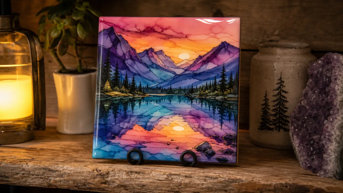
Once you’ve got the basics down, there’s a lot more territory to explore. One of the most impressive things you can do with this technique is combine it with a clear epoxy resin pour. You create your alcohol ink artwork on a tile or canvas, let it dry completely, then pour a thin layer of resin over the top. The resin protects everything permanently and adds this gorgeous, glass-like gloss that makes the colors look almost luminous. It’s become hugely popular for making coasters, wall art panels, and even tabletops — and it’s not hard to see why.
Stenciling is another technique worth trying once you’re ready to push further. You lay a stencil or a mask made from vinyl, tape, or contact paper down on your surface before adding ink and alcohol, and it gives you crisp, defined shapes inside the fluid, abstract background. It’s a great way to bring in text, geometric forms, or representational imagery alongside the more organic ink effects. Negative space masking — covering the areas you want to keep clean and working the ink around them — can produce really sophisticated-looking results.
You can also take this technique to fabric, which opens up a whole world of wearable art. T-shirts, canvas sneakers, tote bags, and scarves all work beautifully. The trick with fabric is to stretch it over a plastic lid or a piece of cardboard before you start. That slightly elevated, non-absorbent backing encourages the ink to pool and spread instead of just soaking straight into the fibers. When the piece is done and fully dry, heat-set it with an iron or run it through the dryer to help lock the ink in place — just keep in mind that fabric ink will fade somewhat with washing over time.
Color Theory and Composition Tips
You don’t need to be a color theory expert to make great work with this technique, but knowing a few basic principles will noticeably level up your results. Analogous colors — ones that sit next to each other on the color wheel, like yellows, oranges, and reds — blend together smoothly and feel cohesive. Think of a warm sunset palette: everything flows naturally into everything else. Complementary colors, which sit opposite each other on the color wheel (purple and yellow, blue and orange), create exciting visual contrast when placed side by side, though if they overlap too much they’ll mix into muddy brown, which is usually something you want to avoid.
Composition matters too, even in a technique that’s largely intuitive. The rule of thirds is a simple but effective guide: rather than centering all your most intense color work right in the middle of the piece, try placing the most interesting interactions roughly a third of the way in from one side or corner. It creates a more dynamic, engaging visual flow. Leaving some areas of negative space — spots where the ink is thin or barely there — also helps. It gives the eye somewhere to breathe and keeps the piece from feeling overwhelming.
One of the most effective things you can do, especially early on, is limit your palette. Pick three to five colors that work well together and stick with just those for the whole piece. It feels like a constraint at first, but it tends to produce more unified, polished work than reaching for every color at once. As you develop your style over time, you can start expanding your palette and playing with more complex color combinations.
Finishing, Sealing, and Caring for Your Artwork
Once your piece is finished, sealing it properly is what takes it from a fun experiment to something that’ll actually last. Sharpie ink is permanent, but left unprotected it can fade from sunlight, get damaged by moisture, or scratch and abrade over time. For paper-based work, a UV-resistant fixative spray is your best friend — apply it in several thin, even coats and you get a protective layer that guards against both fading and moisture. These sprays come in matte, satin, and gloss finishes, so you can match the look you want.
For ceramic and tile work, two-part epoxy resin gives you the most durable and professional-looking finish available. Mix it according to the instructions, pour it over your tile, and spread it evenly with a foam brush or a gloved finger. It self-levels as it cures over the next 24 to 48 hours, settling into a smooth, glossy surface. While it’s curing, cover it with a box or dome to keep dust and debris out. Once it’s fully set, it’s waterproof, heat-resistant, and tough enough for everyday functional use — perfect for coasters or serving boards.
How you store and display the finished work matters too. Keep pieces away from direct sunlight even after sealing, since UV exposure will eventually get to any ink if given enough time. Store unframed paper works flat in an acid-free portfolio or between sheets of glassine paper to protect them from sticking and abrasion. For anything you’re framing, UV-protective glass or acrylic glazing adds another layer of defense against light damage. With a little care, this kind of artwork holds up beautifully for decades.
Troubleshooting Common Problems
Even once you have some experience with this technique, you’ll run into problems occasionally — that’s just part of it. One of the most common frustrations is ink that won’t spread when you apply alcohol, just sitting there stubbornly instead of blooming outward. This usually means the ink dried too fast before the alcohol could reach it, which happens a lot in warm or dry environments. The fix is to move quickly — get your alcohol applicator ready before you even uncap the marker — and if drying speed is a persistent issue, try working somewhere cooler and slightly more humid.
Muddy, dull colors are another thing beginners run into a lot. Usually this comes down to too many colors overlapping in the same spot, especially when complementary colors mix directly together. Being more deliberate about where each color goes relative to the others helps a lot, as does letting layers dry fully before adding new color on top. If a section gets overworked and murky, a clean dry cotton swab can sometimes lift excess ink before it dries and rescue the area before it’s lost.
Unwanted spreading — ink running farther than you wanted it to, overtaking delicate areas or bleeding off the edge — is something that catches a lot of beginners off guard. The solution is usually to use less alcohol and apply it more precisely: a dropper or a lightly-dipped cotton swab gives you much more control than a spray bottle. You can also create physical barriers using wax resist, oil-based mediums, or strips of tape to keep the ink contained to specific areas. The more time you spend with the materials, the better your instincts get for how much alcohol a particular surface and ink combination actually needs — and at that point, controlling spread starts to feel natural rather than like a battle.








What do you think?
It is nice to know your opinion. Leave a comment.