










Luxury Botanical Candle Packaging Design: The Art of Elevating Handcrafted Products
The Philosophy Behind Luxury Botanical Candle Packaging
In the world of premium home fragrance, the packaging is never merely a container — it is an experience unto itself. Luxury botanical candle packaging design occupies a fascinating intersection between artisanal craftsmanship, nature-inspired aesthetics, and sophisticated brand storytelling. When a customer reaches for a beautifully designed candle, the outer presentation whispers promises of the sensory journey waiting inside, setting expectations and evoking emotions long before the wick is ever lit.
The philosophy underpinning great botanical candle packaging begins with respect for the natural world. Botanicals — herbs, florals, leaves, and plant matter — carry centuries of symbolic weight. Lavender suggests calm and healing; rose evokes romance and luxury; eucalyptus speaks of clarity and fresh air. A skilled packaging designer understands these associations deeply and uses visual language to channel them into every label, box, ribbon, and seal. The result is packaging that feels not just beautiful, but meaningful and resonant.
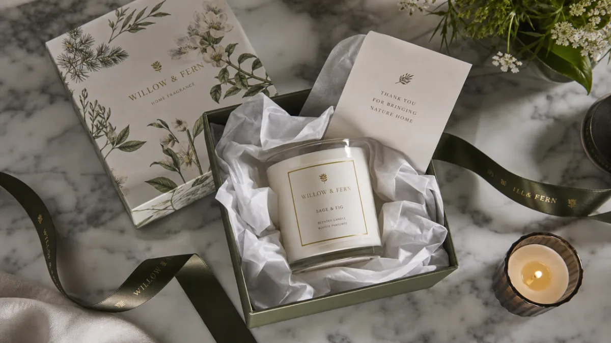
Beyond aesthetics, luxury packaging communicates brand values with precision. Consumers in today’s market are discerning; they read packaging as a text, decoding signals about quality, ethics, and identity. A candle that arrives swathed in cotton tissue paper, nestled in a rigid matte box with foil-stamped botanical illustrations, tells a story of care and intentionality. This is the silent language of premium positioning, and mastering it is essential for any brand aiming to occupy the upper tier of the market.
Core Design Elements That Define Botanical Luxury
The visual vocabulary of luxury botanical candle packaging draws from a rich heritage of botanical illustration, a discipline that flourished during the 18th and 19th centuries when scientists and artists collaborated to document the natural world with extraordinary precision and beauty. Modern packaging designers frequently revisit these archival styles, reinterpreting hand-drawn floral engravings, watercolor herbarium prints, and delicate line-work illustrations through a contemporary lens. The effect is at once nostalgic and fresh, lending products a timeless quality that transcends seasonal trends.
Typography plays an equally critical role in the overall design composition. Serif fonts with refined, classical proportions pair naturally with botanical motifs, reinforcing the sense of heritage and permanence. Conversely, some brands choose to contrast lush, ornate illustrations with stark, modern sans-serif lettering to create visual tension that feels current and editorial. The interplay between typographic choice and illustrative style is where much of a brand’s individual personality is expressed, making font selection one of the most consequential decisions in the design process.
Color palette construction in luxury botanical packaging tends to follow one of several distinct philosophies. The most prevalent is the naturalistic approach, which draws directly from the palette of the featured botanicals — dusty sage greens, soft blush pinks, warm ivory, and deep botanical browns. Alternatively, some luxury brands opt for dramatic contrast, placing intricate floral illustrations against deep navy, forest green, or rich charcoal backgrounds, creating a jewel-box effect that commands attention on retail shelves. A third school favors restraint, using monochromatic schemes that allow form and texture to carry the visual weight entirely.
- Hand-drawn or engraved botanical illustrations that reference historical herbarium traditions
- Thoughtfully selected serif or script typography that complements the organic aesthetic
- Naturalistic or jewel-toned color palettes drawn from the featured plant ingredients
- Premium finishing techniques such as foil stamping, embossing, and letterpress printing
- Sustainable material choices that align packaging ethics with brand values
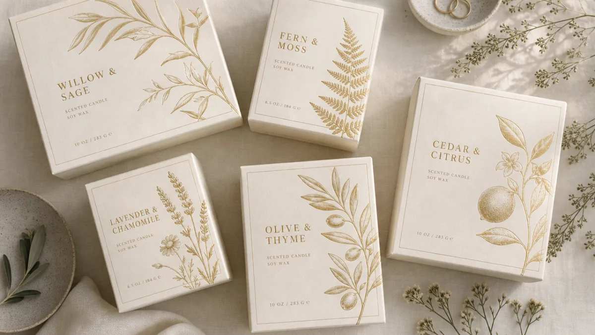
Materials and Finishing Techniques That Elevate the Tactile Experience
Luxury is as much a tactile experience as it is a visual one, and nowhere is this more apparent than in premium candle packaging. The choice of substrate — the paper, board, or material on which designs are printed — profoundly influences how consumers perceive quality. Heavy-weight cotton rag papers carry a tangible sense of substance and permanence. Uncoated matte boards with a slight texture invite the fingertips to linger, communicating an artisanal sensibility that glossy, commercial finishes simply cannot replicate. Even the gentle resistance of a well-constructed rigid box as its lid is removed becomes part of the branded ritual.
Finishing techniques transform already beautiful printed designs into truly extraordinary objects. Hot foil stamping, one of the most beloved tools in luxury packaging, applies thin metallic or pigmented foils under heat and pressure, creating details that catch and reflect light in a way that no ink can replicate. Gold and copper foils are perennial favorites in the botanical category, evoking warmth and richness that complement earthy plant palettes beautifully. Blind embossing — pressing a design into the surface of paper without ink or foil — creates subtle, tactile details that reward close attention and reinforce the sense that every element of the packaging has been carefully considered.
Sustainable materials have moved from a niche consideration to a central pillar of luxury botanical packaging strategy. Today’s conscious luxury consumer expects their premium purchases to align with environmental values, and brands that ignore this expectation do so at significant reputational risk. Fortunately, the intersection of sustainability and luxury is rich with beautiful possibilities. Recycled and FSC-certified papers, vegetable-based inks, soy-based adhesives, and compostable tissue wraps can all be deployed without any sacrifice in visual or tactile quality. In fact, the natural, unbleached tones of many eco-conscious materials lend themselves particularly well to the botanical aesthetic, creating a harmonious alignment between message and medium.
Beyond paper and board, supplementary packaging elements contribute enormously to the perceived value of the overall presentation. Grosgrain or satin ribbons in coordinating colors add a gift-worthy finishing touch. Custom wax seals embossed with a brand monogram or botanical motif create a sense of occasion around opening. Decorative tissue paper printed with an all-over botanical pattern wraps the candle vessel inside the outer box, ensuring that every layer of the unboxing experience delivers visual delight. These layered details, when executed with restraint and coherence, accumulate into an impression of extraordinary care and craftsmanship.
Label Design: The Heart of Candle Brand Identity
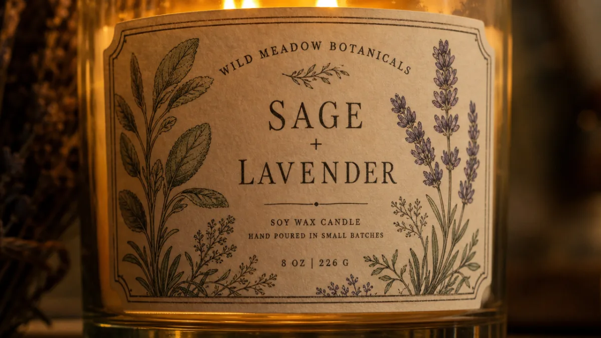
For candles sold in glass vessels or tins, the label is often the primary canvas for botanical design expression, and its importance cannot be overstated. A well-designed candle label must accomplish multiple objectives simultaneously: it must identify the scent clearly, communicate brand identity, convey the luxury positioning of the product, and remain beautiful in the context of a home interior — because unlike most packaged goods, candles are displayed and live in people’s living spaces long after purchase. This last consideration makes label design for candles uniquely demanding and rewarding.
The format and shape of a candle label open interesting design possibilities that rectangular labels alone cannot provide. Circular labels suit apothecary-style amber or clear glass jars beautifully, evoking vintage potion bottles and herbalist’s dispensaries. Arch-shaped labels have risen to particular prominence in the premium candle market, their curved tops echoing the forms of classic botanical prints and stained-glass windows alike. Wrap-around labels that circle the entire vessel allow for more generous illustration space and can create a panoramic botanical scene that rewards slow, contemplative looking — an interaction perfectly aligned with the meditative quality of candlelight.
The information hierarchy on a luxury candle label deserves the same careful attention as the visual design elements. Brand name, scent name, and key botanical ingredients form the primary communication layer. Secondary information — burn time, net weight, care instructions, and ingredient declarations — must be present for regulatory and practical reasons, but should be handled with typographic finesse that prevents it from cluttering the design. Many premium brands solve this elegantly by placing secondary information on the base of the vessel or on a small secondary label, preserving the pristine beauty of the main label while remaining fully compliant with labeling requirements.
- Establish a clear visual hierarchy that leads the eye from brand name to scent name to botanical feature
- Choose label shape and format that complements the vessel form factor
- Select illustration style and color palette that will remain beautiful in domestic interior contexts
- Apply premium finishing — foil, embossing, or varnish — to the label to enhance perceived quality
- Ensure regulatory information is present but handled with typographic care
- Test label adhesion and print durability against candle surface heat and potential wax drips
Brand Storytelling Through Botanical Packaging Narratives
The most powerful luxury botanical candle packages do more than look beautiful — they tell a story. This narrative dimension of packaging design is what transforms a commercial product into an emotional artifact, something a customer feels compelled to keep, gift, and photograph. Storytelling in packaging can operate at multiple levels simultaneously: the overall visual identity tells a macro story about the brand’s heritage and values, while specific scent packaging tells a micro story about the provenance and character of individual ingredients. When these layers cohere into a unified narrative, the result is packaging that resonates with unusual depth and authenticity.
Provenance is a particularly potent storytelling device in the botanical category. Consumers respond viscerally to specificity — not just “lavender” but “Provençal lavender harvested at peak bloom,” not just “cedarwood” but “sustainably sourced Atlas cedar from the Moroccan mountains.” Packaging design can support and amplify these provenance claims through visual cues: a map motif suggesting geographic origin, a harvest-scene illustration evoking agricultural tradition, a color palette drawn from the landscape of a specific region. These details signal authenticity and depth of sourcing, qualities that discerning luxury consumers actively seek and genuinely value.
Seasonality offers another rich narrative vein for botanical candle packaging. Many brands develop limited-edition packaging for different seasons, creating collections that evolve over the year while maintaining a consistent underlying aesthetic language. Autumn editions might feature richly colored illustrations of berries, dried seed heads, and turning leaves in ochre, rust, and burgundy. Winter collections might shift to deep evergreen palettes with frosted berries and bare branch silhouettes. These seasonal variations give collectors a reason to return repeatedly, building brand loyalty through the pleasure of anticipation and discovery.
The ritual of candle use itself offers packaging designers a compelling storytelling anchor. Candles have been central to human ritual — religious, romantic, contemplative, celebratory — across cultures and millennia. Packaging that acknowledges this ritual dimension, however subtly, connects the product to something larger and more meaningful than mere home fragrance. Some brands achieve this through the inclusion of small ritualistic accessories: a handwritten note suggesting an intention-setting practice, a sprig of dried herb tied to the ribbon, a small card with the history and symbolic meaning of the featured botanical. These inclusions cost relatively little to produce but contribute enormously to the sense that opening the package is itself a meaningful act.
Practical Considerations: Structural Design and Functional Excellence
Beautiful packaging that fails to protect its contents is a luxury failure of the most fundamental kind. Structural packaging design for candles must account for the considerable practical challenges posed by the product’s weight, fragility, and the heat sensitivity of wax. Glass candle vessels are heavy and prone to chipping and cracking; rigid outer boxes must be engineered with appropriate wall thickness and base construction to prevent movement during shipping. Inner fitments — formed card inserts, tissue-padded trays, or custom molded pulp cradles — hold vessels securely in place, preventing the kind of catastrophic damage that destroys both the product and the customer’s confidence in the brand.
The e-commerce channel has added significant new requirements to luxury candle packaging design. Products that travel through postal and courier networks encounter impacts, compression, and handling conditions that retail packaging alone was never designed to withstand. Many brands now design two-tier packaging systems: a beautiful outer retail presentation box, itself housed within a plain corrugated shipping box with additional protective padding. Getting this balance right is a genuine design challenge — the retail packaging must be protective enough to survive reasonable handling without the e-commerce shell, yet not so over-engineered with plastic internal structures that it conflicts with sustainability messaging.
Ease of opening and closing merits more design attention than it typically receives in the luxury packaging world. A box whose lid is difficult to remove, or a ribbon that tangles and frays, creates micro-frustrations that subtly undermine the premium experience. Conversely, a lid that slides off with smooth, satisfying resistance, or a box that opens via a magnetic closure with a quiet, definitive click, contributes a moment of kinetic pleasure to the unboxing ritual. These functional elegances are the marks of truly accomplished packaging design, distinguishing brands that think holistically about the user experience from those that have prioritized visual beauty at the expense of practical satisfaction.
- Wall board thickness and base construction sufficient to prevent product movement in transit
- Inner fitments that cradle vessels securely without requiring non-recyclable plastic foams
- Lid tolerances calibrated for satisfying, effortless removal
- Exterior finishes durable enough to resist scuffing and moisture during shipping
- Two-tier packaging architecture for brands with significant e-commerce volume
Trends Shaping the Future of Botanical Candle Packaging
The luxury botanical candle packaging landscape is evolving rapidly, shaped by shifting consumer values, new production technologies, and the ever-present pressure to differentiate in a crowded market. Among the most significant emerging trends is the move toward truly regenerative packaging materials — not simply recycled or recyclable, but actively restorative. Seed paper labels that can be planted after use, packaging boards embedded with wildflower seeds, and vessels made from biodegradable or compostable materials all signal a direction of travel in which the end of the product’s life becomes as beautiful and meaningful as its beginning.
Digital craft tools have opened new frontiers in botanical illustration styles available to packaging designers. While the classical hand-drawn aesthetic remains dominant and beloved, designers are now able to work with extraordinary precision and complexity using digital illustration platforms that simulate the look of traditional media — watercolor, gouache, engraving, and linocut — with none of the production constraints. This has enabled a flowering of illustrative diversity within the botanical category, with brands differentiating through highly distinctive visual signatures rather than competing within the same narrow aesthetic bandwidth. The result is a market full of genuinely original visual voices.
Personalization represents perhaps the most transformative trend on the horizon for luxury botanical candle packaging. Digital printing technologies now allow short-run and on-demand personalization at costs that were unthinkable a decade ago. Brands are beginning to offer customers the ability to select their preferred botanical illustration, choose a colorway, and add a personalized message or name — all without the prohibitive minimum order quantities that once confined customization to corporate gifting budgets. This democratization of bespoke packaging has profound implications for how luxury brands build relationships with individual customers, shifting from mass premium to genuinely personal luxury.
Minimalism and maximalism continue their productive creative tension within the botanical packaging world, with neither approach showing signs of ceding ground to the other. Ultra-minimal packaging — a single hand-stamped botanical sprig on unbleached kraft board, or a solitary engraved initial on a smooth white box — appeals to consumers who associate understatement with genuine confidence and quality. Meanwhile, richly maximalist designs that cover every available surface with exuberant botanical pattern continue to generate extraordinary social media engagement and gifting appeal. The most interesting design work in the space often exists between these poles, deploying restraint and abundance in deliberate, considered counterpoint to one another, creating compositions that reward both the first glance and the lingering look.








What do you think?
It is nice to know your opinion. Leave a comment.