










Retro Colorful Hand Drawn Stripped Groovy Cute Business Cards: A Complete Guide to Standing Out with Vintage-Inspired Design
The Resurgence of Retro Design in Modern Business Branding
In a world saturated with sleek, minimalist design aesthetics, the retro and groovy visual language of the 1960s and 1970s has made a triumphant comeback across branding, packaging, and marketing materials. Business cards, once considered a formality in professional networking, have become powerful first-impression tools that reflect personality, creativity, and brand identity. The retro colorful hand-drawn stripped groovy aesthetic taps into a deep cultural nostalgia while simultaneously feeling fresh, bold, and utterly distinctive in a sea of generic white cards with black text.
This revival is not accidental. Consumers and clients today increasingly gravitate toward brands that feel human, warm, and authentic. The hand-drawn quality of groovy retro design communicates exactly that — it signals that a real person with genuine passion and creativity stands behind the business. Unlike digitally precise, cold corporate visuals, hand-drawn elements carry an inherent warmth and imperfection that paradoxically makes them more trustworthy and approachable. When someone hands you a business card that looks like it was lovingly illustrated, you instinctively feel a connection before you even read the name on it.
The groovy aesthetic specifically draws from psychedelic art, vintage poster design, and the hand-lettering traditions of mid-century commercial illustration. Think bold curved typography, wavy stripe patterns, earthy-meets-electric color palettes featuring mustard yellows, burnt oranges, avocado greens, and deep teals — all rendered with that slightly wobbly, joyful imprecision that defines hand-drawn art. Applied to a business card, these elements transform a small rectangle of cardstock into a miniature piece of art that people genuinely want to keep rather than toss in a drawer.
For creative professionals — illustrators, photographers, event planners, boutique shop owners, personal chefs, yoga instructors, and anyone whose livelihood depends on standing out — a retro groovy business card is not just a contact card. It is a statement of values: that you care about beauty, that you bring creativity to everything you do, and that you refuse to blend into the background. It sets the tone for every professional relationship before a single word is spoken, making it one of the most cost-effective branding investments available.
Anatomy of the Perfect Retro Groovy Business Card Design
Understanding what makes a retro groovy business card visually successful requires breaking down its key design elements. The most immediately striking component is the stripe pattern, which in this style appears not as crisp geometric lines but as slightly uneven, hand-drawn bands of color that radiate energy and movement. These stripes might run diagonally across the card, frame the edges as a border, or flow in a wavy, undulating pattern that mimics the psychedelic art of the Woodstock era. The unevenness is intentional — it is what separates this look from generic stripe templates and gives it that irreplaceable human touch.
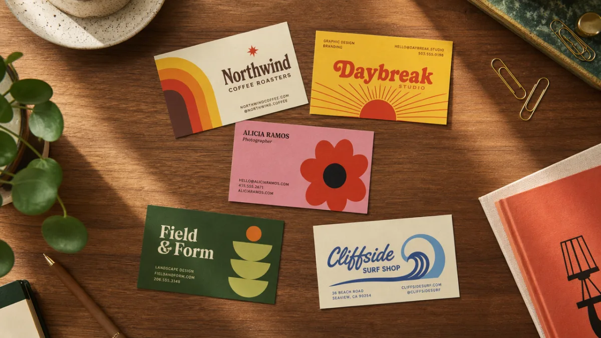
Color selection is perhaps the single most important decision in creating a groovy retro business card. The palette should feel vibrant and celebratory without tipping into garish or overwhelming. Classic combinations include warm terracotta paired with cream and forest green, or a bolder mix of cobalt blue, sunshine yellow, and coral pink. The key is to select colors that feel period-authentic while still reading well on a small card format. Contrasting light and dark tones ensure that contact information remains legible even against colorful backgrounds, which is a practical consideration that should never be sacrificed for aesthetics.
Typography in the groovy retro tradition leans heavily on hand-lettered fonts with thick strokes, rounded terminals, and playful personality. Classic examples include bubble letters, slab-serif fonts with imperfect baselines, and psychedelic display faces with exaggerated swashes and flourishes. The business card format demands hierarchy: the name should command the most visual weight, followed by the job title or business name, and then the contact details in a smaller but still legible size. Mixing one display font for the name with a simpler, clean font for contact information creates visual interest while maintaining readability.
Additional decorative elements often found in this style include hand-drawn botanical motifs such as daisies, mushrooms, and leaves; abstract shapes like stars, moons, and swirls; and small illustrated icons that relate to the person’s profession. A florist might include a hand-drawn bouquet; a music producer might incorporate a stylized vinyl record or guitar. These small details elevate the card from a mere information carrier to a miniature illustration that encapsulates the brand’s entire personality in a 3.5 by 2 inch space — a remarkable design challenge that, when executed well, produces something genuinely magical.
Choosing the Right Color Palette for Your Groovy Business Card
Color psychology plays a significant role in how a business card is received and remembered. In the retro groovy tradition, color is not merely decorative — it is communicative. Each color choice sends a message about the brand’s personality, and the combination of colors creates an overall emotional impression that lingers long after the card changes hands. Understanding this interplay helps designers and business owners make intentional choices rather than simply selecting colors they personally find attractive, though personal affinity and authentic self-expression are absolutely valid starting points.
Warm color palettes — those built around reds, oranges, yellows, and pinks — convey energy, enthusiasm, creativity, and approachability. A business card in shades of paprika, golden yellow, and off-white feels instantly inviting and suggests a brand with high energy and expressive personality. These palettes work beautifully for creative industries, food and hospitality businesses, and anyone whose work is celebratory or experiential in nature. The warm groovy palette is particularly associated with the 1970s aesthetic, evoking harvest kitchens, disco halls, and the golden hour photography of that decade.
Cool and earthy palettes tell a different story while remaining firmly within the retro groovy tradition. Combinations of sage green, dusty blue, warm beige, and chocolate brown suggest calm creativity, connection to nature, and a grounded, thoughtful approach to work. This palette suits wellness practitioners, sustainable brands, artisan craftspeople, and anyone whose brand identity includes values of intentionality and environmental consciousness. The earthy groovy palette draws more from the 1960s folk and counterculture aesthetic than the glam of the following decade, and its softer quality can feel surprisingly sophisticated.
For those who want maximum visual impact, a high-contrast multicolor approach uses four or more colors in bold, saturated tones across the card. This is the most psychedelic option and the most demanding to execute well. Success depends on a strong underlying structure — the stripe pattern, for instance, provides the organizing framework that prevents multi-color cards from descending into visual chaos. When the stripes run in orderly bands even as the colors within them are wildly varied, the eye can follow the composition with ease and delight. This approach works best for brands that are genuinely bold, unconventional, and unafraid of attention.
A practical consideration often overlooked in color selection is how the chosen palette will translate across different printing methods. Digital printing reproduces vibrant colors accurately, while offset printing with Pantone inks provides the most consistent results for specific color matching. Letterpress printing, which creates an embossed impression in the cardstock, can add dimensional texture to a groovy design but is limited in color range. Risograph printing, increasingly popular with indie designers, produces that slightly misregistered, grainy quality that perfectly complements the hand-drawn aesthetic — its imperfections are entirely in keeping with the retro spirit.
How to Customize a Retro Groovy Business Card Template Effectively
Starting with a professionally designed template, such as those available on platforms like Pinterest, Canva, Adobe Express, or Etsy, gives you a strong visual foundation while still allowing for meaningful personalization. The key to successful template customization is knowing which elements are essential to the aesthetic — and therefore should be preserved — and which elements exist to be replaced with your own information and brand specifics. A stripe pattern and hand-drawn typography are core to the groovy retro look; the specific colors and decorative motifs are highly customizable.
When personalizing a template, begin with your information hierarchy. Decide what the most important thing on the card is — usually your name or business name — and ensure it occupies the dominant visual position. Then arrange your title, specialty, or tagline in a secondary position with a slightly smaller type treatment. Contact information including phone number, email address, website, and social media handles should be present but visually subordinate, readable without competing with the personality-driven design elements. Many groovy retro cards use the back of the card for contact details, allowing the front to function purely as a visual statement.
Color customization should be approached systematically rather than intuitively swapping colors one at a time. Identify the role each color plays in the original design — background, primary stripe, secondary stripe, text, accent — and replace each with a color from your own chosen palette that plays the same role. Swapping a light background color for another light color and a dark stripe color for another dark one maintains the tonal contrast that makes the design legible. Making a light-background color darker can suddenly make text unreadable, requiring additional adjustments throughout the design.
Adding personal illustrative elements is where customization becomes genuinely exciting. If you have illustration skills, drawing small motifs by hand and scanning them to incorporate into your digital design is the most authentic approach. Alternatively, sourcing hand-drawn clip art and illustration sets from marketplaces like Creative Market ensures that your additions feel stylistically consistent with the template’s hand-drawn aesthetic. The motifs you choose should relate meaningfully to your work or personality — they are not merely decoration but storytelling elements that communicate who you are before anyone reads your job title.
Finally, consider the physical specifications of your card. Standard business card size is 3.5 by 2 inches in the United States, but square cards, rounded-corner cards, and mini cards are all increasingly common and can add an extra layer of personality to a groovy retro design. Cardstock weight and finish also matter significantly: a thick, matte card with soft-touch lamination feels luxurious and intentional, while an uncoated natural paper stock reinforces the hand-crafted, artisanal quality of the design. Some designers even opt for kraft paper stock in warm brown tones, which pairs beautifully with earthy groovy palettes and needs no further explanation to feel special.
Practical Tips for Printing and Distributing Your Retro Business Cards
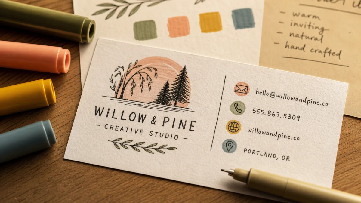
Once your design is finalized, the printing process determines whether your vision becomes a reality or a disappointment. Choosing the right print vendor is as important as the design itself. For small runs of twenty-five to one hundred cards, online services such as Moo, Vistaprint, Canva Print, and Zazzle offer convenience, competitive pricing, and surprisingly good quality. For larger runs or specialty printing techniques like letterpress, foil stamping, or edge painting, working with a local print shop or a specialty printer like Mama’s Sauce, Hatch Show Print, or Boxcar Press will yield results that genuinely stand out.
Always request a physical proof before committing to a full print run, especially for a colorful design where screen color and printed color can differ meaningfully. What looks vibrant and balanced on a monitor may appear duller or differently balanced on paper due to the difference between RGB color (which screens display) and CMYK color (which printers use). If specific colors are critical to your brand, providing Pantone color codes to your printer ensures the most accurate reproduction, though this is typically available only through offset or specialty printing and comes at higher cost than digital printing.
File preparation is a technical step that designers and non-designers alike can find intimidating but is genuinely important. Print-ready files should be in CMYK color mode, at 300 DPI resolution, with a bleed area of at least 0.125 inches on all sides extending beyond the card’s final dimensions. The bleed ensures that when the card is trimmed, there are no white edges showing where the background color should extend to the card’s edge — a common and easily avoidable error that undermines the professional quality of even the most beautiful design. Many templates and print platforms guide users through this process automatically.
Distribution strategy matters as much as the card’s design. Consider these approaches for getting your groovy retro cards into the right hands:
- Keep a small stack in your bag or wallet at all times so you are always prepared for spontaneous networking opportunities at coffee shops, markets, and social gatherings.
- Leave cards at complementary local businesses — a florist’s cards might sit at a wedding venue; a photographer’s cards at a frame shop or bridal boutique.
- Include a card in every physical order or package you ship, turning each delivery into a branding moment.
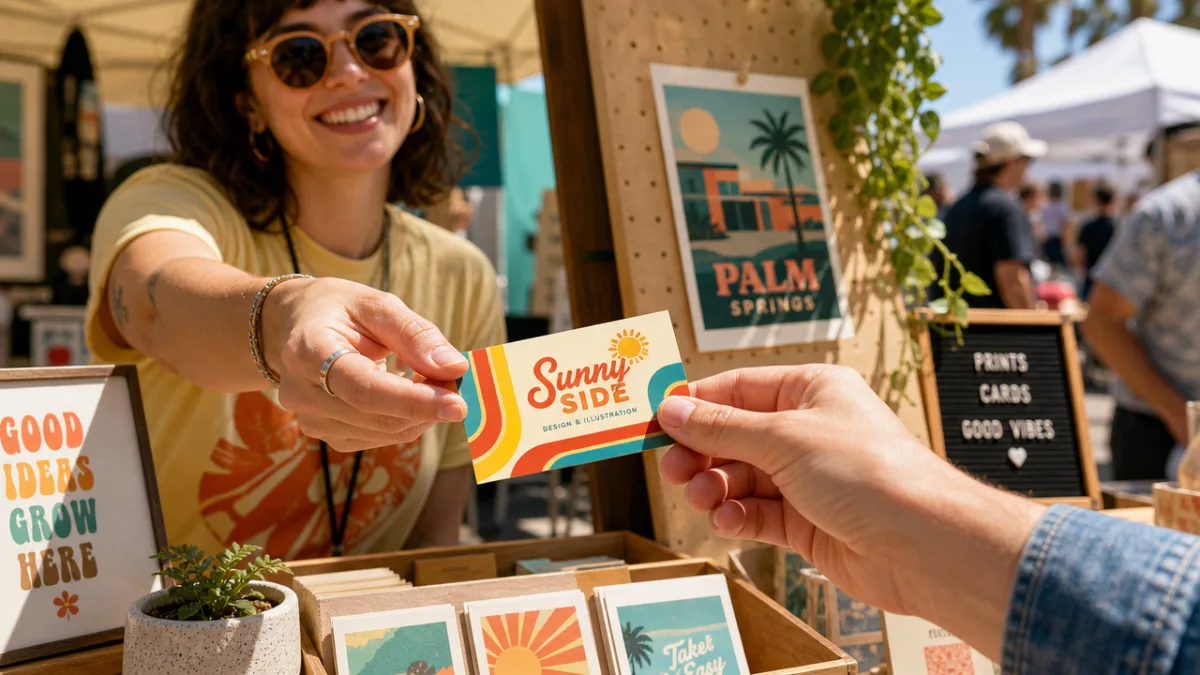
- Bring a generous supply to craft fairs, markets, pop-up shops, and industry events where face-to-face connection is the primary goal.
- Use your card as a bookmark, gift tag, or envelope seal to maximize its visibility and extend its life beyond the initial exchange.
Beyond physical distribution, consider creating a digital version of your retro groovy business card as a shareable image for social media profiles, email signatures, and digital press kits. Platforms like Instagram and Pinterest respond extremely well to bold, colorful, visually distinctive content, and a beautifully photographed flat-lay image of your cards can itself become a piece of content that attracts attention and communicates your brand aesthetic to a wide audience. Styling the photo with complementary props — vintage objects, flowers, colorful stationery — extends the groovy retro narrative and makes the image more shareable and memorable across digital platforms.
Inspiring Creative Professionals Who Are Winning with Retro Groovy Branding
The retro groovy aesthetic is not limited to any single industry, and some of the most compelling examples of its use come from unexpected professional contexts. Independent tattoo artists have embraced hand-drawn groovy business cards as natural extensions of their illustration-heavy craft, using bold stripe backgrounds and psychedelic typography to immediately communicate their artistic sensibility to prospective clients. For a tattoo artist, the business card is essentially a mini portfolio piece — the quality and personality of its design directly signal what kind of work the artist produces, making the investment in a beautifully crafted card a direct business development tool.
Food entrepreneurs — including small-batch jam makers, specialty bakers, private chefs, and farmers market vendors — have found that retro groovy branding connects powerfully with consumers who value craft, authenticity, and a personal relationship with the producers they support. A hand-drawn groovy card handed across a market stall carries the message that the food it represents was made with the same care and personality that went into the card’s creation. This kind of visual consistency across touchpoints — from card to packaging to social media — builds the kind of brand coherence that transforms one-time buyers into loyal advocates and devoted return customers.
The wellness and healing arts community has also embraced the retro aesthetic in ways that feel spiritually aligned with its values. Yoga teachers, reiki practitioners, herbalists, and massage therapists find that the earthy, hand-crafted quality of groovy retro design resonates with clients who are seeking holistic, human-centered care. The imperfection and warmth of hand-drawn elements communicate humanity, approachability, and genuine care — exactly the qualities that build trust between a wellness practitioner and the clients who literally place their physical and emotional wellbeing in their hands. In this context, the business card becomes not just a marketing tool but a reassuring first handshake.
Creative service providers including graphic designers, art directors, copywriters, and brand strategists occupy an interesting position when it comes to business card design — their card is simultaneously a credential and a portfolio piece, demonstrating their own aesthetic sensibility and design judgment. Choosing a retro groovy hand-drawn design communicates a specific set of values: a love of craft and illustration, an appreciation for design history and cultural context, a willingness to embrace color and personality, and a rejection of the generic and predictable. For clients seeking creative partners with genuine point of view and expressive range, this card does significant persuasive work before any formal presentation begins.
Ultimately, the retro colorful hand-drawn stripped groovy cute business card represents a philosophy as much as a visual style. It says that work should be joyful, that personality should be celebrated, that craft matters, and that the small details — even a tiny card that costs pennies to print — deserve the same creative attention and intention as the most significant projects. In an era when so much professional interaction happens through screens and algorithms, a beautiful physical card placed into another person’s hand creates a moment of genuine human connection. It is held, looked at closely, tucked into a wallet or pinned to a board — and every time it reappears, it brings your name, your work, and your irreplaceable personality back into the room.








What do you think?
It is nice to know your opinion. Leave a comment.