










Luxury Wine-Red Ribbed Candles & Brass Decor: The Complete Guide to Moody Aesthetic Home Styling
The Allure of the Moody Aesthetic: Why Wine-Red and Brass Belong Together
There’s something almost magnetic about a room that manages to feel both intimate and dramatic at the same time — a space where the light seems alive and every surface has something to say. The moody aesthetic has won over interior designers and home enthusiasts in a big way, and honestly, it makes sense. After years of bright, minimalist interiors dominating every design feed and magazine spread, a lot of people are craving something that actually wraps around you. Wine-red and brass are the foundation of that feeling, and together they do something that neither could quite pull off alone.
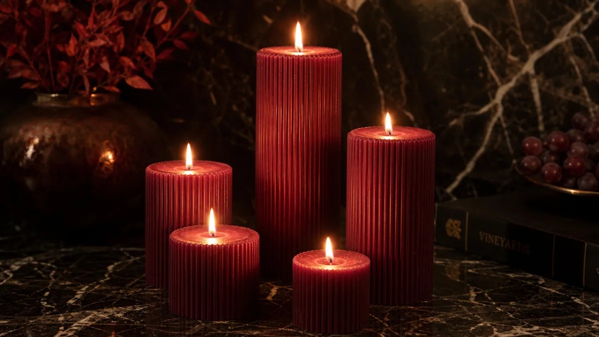
Wine-red carries a lot of history with it as a color. It brings to mind candlelit feasts, velvet theater curtains, the deep pleasure of a good Bordeaux on a cold winter night. When you put that color into wax — especially in a ribbed pillar candle with all that texture and structure — it stops being just a color and becomes something you almost want to reach out and touch. Those ridges catch and release light in a way smooth candles never do, sending shadows and highlights dancing across the surface every time the flame moves. It’s not decoration that just sits there; it actually does something.
Brass, meanwhile, has had quite the comeback. It spent years in the background while chrome and brushed nickel took the spotlight, but now it’s firmly back as the warm metal for people who want their rooms to feel genuinely lived-in rather than showroom-ready. In daylight it reads as a rich antique gold; once the candles are lit and the overhead lights are dimmed, it deepens into something closer to amber. Next to wine-red candles, that combination lands somewhere between opulent and cozy — not showy, but confident. Like someone who simply knows what they love.
Choosing the Right Ribbed Candles: Shape, Size, and Quality
Ribbed candles are not all made the same, and once you know what to look for, the difference between a great one and a mediocre one is pretty obvious. It starts with the wax. Good pillar candles are usually made from a paraffin-beeswax blend or a quality soy blend, and they burn cleaner and more evenly than cheaper options. A wine-red candle worth its price tag should hold that deep color as it burns — if it starts fading to a washed-out pink after the first hour, the pigmentation wasn’t up to the job. The ribbing, too, should have crisp, clean edges that stay defined even as the wax warms near the flame.
Proportions matter a lot here. Tall, slender ribbed pillars — somewhere in the twelve-to-eighteen-inch range — pull the eye upward and give a room a sense of height. Shorter, wider cylinders around three to four inches in diameter feel more grounded and substantial, and they’re especially good when you cluster a few together at different heights. That odd-numbers rule is genuinely useful: three candles of varying heights grouped together will almost always look more interesting than two matching ones placed symmetrically, which can feel a bit stiff and deliberate in a way that works against the whole organic, atmospheric vibe.
When you’re shopping, a few things are worth paying close attention to. The rib depth should be deep enough to read from across the room — shallow ribbing loses most of its textural impact once the lighting drops. For wine-red specifically, you want an opaque wax with real color saturation; anything with a translucent quality tends to read more maroon or purple than the true burgundy that makes this palette sing. And on the fragrance question, unscented or lightly scented candles are usually the better call in decorative arrangements, since burning several strongly scented candles in a small room can quickly become overwhelming.
One last thing worth checking: the base. A flat, well-finished bottom keeps the candle stable on any surface, while some higher-end candles have a slightly concave base designed to seat better in a holder. It sounds like a small detail, but a candle that wobbles or sits at an angle undermines that composed, intentional feeling that the whole aesthetic depends on.
Brass Decor Elements That Elevate the Wine-Red Palette
Brass and wine-red have a genuinely special relationship — they’re working in the same warm, rich register, so when you put them together, each one makes the other look better. Brass candle holders are the natural place to start, and they’re worth choosing carefully. Look for holders with some real visual interest to them — fluted columns, geometric pedestals, sculptural shapes that feel like they’re in conversation with the candle’s own ribbed texture. Even a brass taper holder used as a standalone piece, without a candle in it, can be a lovely sculptural element on a shelf or side table.
Beyond holders, brass earns its place in a moody room through picture frames, mirrors, bookends, and small decorative objects. A brass-framed mirror above a styled console table is one of the smartest moves you can make: it bounces candlelight back into the room, essentially doubling the warmth without adding a single extra light source. Antiqued or unlacquered brass is particularly well-suited here, because it develops a natural patina over time and avoids that overly polished finish that can veer into territory that feels more Vegas showroom than cozy library. The slight variation across an unlacquered surface — darker in the recesses, brighter on the raised edges — actually mirrors the tonal complexity of wine-red in a way that feels intentional and considered.
Brass vases and vessels open up even more possibilities. A tall, slender brass bud vase with a single dried stem — pampas grass, preserved eucalyptus, a sculptural seed pod — creates a lovely vertical accent alongside your candles while adding organic texture to the mix. Low, wide brass bowls work beautifully as bases for floating candles, or filled with polished stones, dried botanicals, or small crystals that catch the light from underneath. These secondary elements are what take a styled surface from “a collection of things” to something that actually tells a story.
Styling Surfaces and Vignettes: The Art of Moody Composition
At its core, a styled vignette is a small story told through objects. The best moody aesthetic arrangements feel like they were discovered rather than staged — as if the person who lives there just put things where they made sense, and the beauty happened naturally. Getting to that effortless quality actually takes quite a bit of thought and, more importantly, restraint. The most common mistake people make with moody styling is cramming too much onto every surface. When there’s no breathing room, the eye doesn’t know where to land and the whole thing reads as chaotic rather than atmospheric. The empty space is doing just as much work as the objects.
For a fireplace mantel, try building around a large brass mirror or piece of artwork at the center, then flanking it asymmetrically with candles at different heights. The asymmetry is doing a lot here — taller candles on one side, lower candles or other objects on the other creates a balance that feels relaxed and organic rather than rigid. A brass clock, a small stack of dark-spined art books, or a sculptural ceramic in a deep clay tone can fill out the composition without competing with the candles for attention. You want the eye to wander through the arrangement, picking up new details on each pass, rather than absorbing everything in one glance.
Coffee table styling follows its own logic in this aesthetic. Start with a foundation — a large dark tray in lacquered wood or matte black ceramic works really well — then layer upward with two or three wine-red candles, a small brass object, and one organic element like a piece of natural stone or a little vessel of dried flowers. Keep the arrangement on one half or one end of the table and leave the rest genuinely open. A coffee table so styled that you can’t set down a cup of tea has been overdone, no matter how beautiful the pieces are individually.
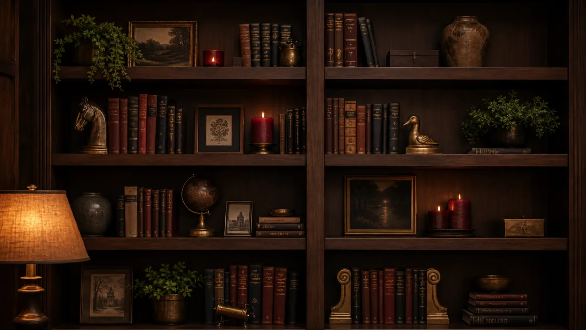
Bookshelves might be the richest canvas of all for this kind of styling, because you get to layer across multiple levels and depths. Mix books with candles placed directly on the shelves (unlit, or carefully managed), brass bookends, small framed photographs, and trailing dried botanicals. The wine-red of the candles will naturally draw the eye through the composition, creating a rhythm across the shelf face that purely decorative objects often struggle to achieve on their own.
Lighting Design: Making Candlelight Work Harder in Your Space
Candlelight alone, as beautiful as it is, isn’t really going to light a room for everyday use. The real skill in moody lighting is layering — using multiple warm, low-level sources so the candles serve as the emotional heart of the room while everything else supports the overall livability of the space. The thread connecting all these sources is color temperature. You want to stay in the warm range throughout, ideally between 2200K and 2700K, which is that amber-gold zone that feels like candlelight rather than the blue-white of daylight bulbs or overhead fluorescents.
If there’s one upgrade that will genuinely transform a room you want to feel moody and atmospheric, it’s dimmer switches. Being able to drop your overhead lighting to thirty or forty percent of its full output completely changes the relationship between electric light and candlelight. At full brightness, overhead fixtures wash the candles out and make them feel purely decorative. Turn it down, and suddenly the overhead light is just doing its job quietly in the background while the candles take over as the primary visual experience. It’s a pretty dramatic shift for a relatively small investment.
Table lamps with dark or richly colored shades — deep burgundy, forest green, navy linen — pull double duty in a moody room. They bring task lighting down to a human scale, close to where you actually sit and work, while also filtering their light through a lens that reinforces the room’s palette. A lamp with a wine-red shade near your candle vignette creates a real visual dialogue between the two — the lamp echoes the color, the candles bring movement and dimension that no bulb ever could. Together, they make the corner feel considered in a way that neither would achieve on its own.
Seasonal and Occasion Styling: Adapting the Moody Aesthetic Year-Round
One of the best things about the wine-red and brass palette is how well it travels across seasons and occasions. It feels most at home in autumn and winter — when short days and cold evenings make a candlelit, intimate interior feel like exactly what you need — but the core of the aesthetic works year-round with some thoughtful adjustments. The key is knowing which elements are anchors and which are flexible. The wine-red candles and brass accents are your foundation; they stay. The organic and textile elements around them are what you shift with the seasons.
In autumn, lean into how naturally wine-red fits the season’s broader palette. Bring in dried maple leaves, mini pumpkins in deep orange and burgundy, arrangements of dried grasses alongside your candle groupings. Layer throws in rust, ochre, and chocolate brown across the sofa and armchairs. Cinnamon and clove scents — through scented candles kept separate from your decorative unscented ones, or simply a pot of spiced cider on the stove — bring the whole atmosphere together through smell as much as sight. Come winter, the palette deepens: pine branches, gilded seed pods, and rich evergreen botanicals frame the wine-red candles with a seasonal intensity that feels genuinely luxurious.
Spring and summer call for a lighter touch, but you don’t have to abandon the aesthetic. Swap dried botanicals for fresh flowers in moody, saturated tones — burgundy dahlias, plum roses, dark-centered anemones in your brass vessels. Trade out heavier textiles for lightweight linens while keeping the color palette rich rather than pale. Let more natural light into the space during the day and let the candles do their atmospheric work in the evenings, when they become the main event rather than all-day sculptural pieces. It’s a slightly different role, but no less compelling.
For hosting and dinner parties, this aesthetic is genuinely hard to beat. A dining table with wine-red pillar candles of varying heights running down the center, interspersed with brass candlesticks and small organic elements, creates the kind of atmosphere that makes guests feel immediately like they’re somewhere special. The candlelight flatters everyone at the table, gives people natural points of focus for conversation, and tells whoever’s sitting there that you thought about more than just the food. That’s really what the moody aesthetic is about at its best — taking a domestic space and making it feel genuinely curated, considered, and warmly, unmistakably alive.








What do you think?
It is nice to know your opinion. Leave a comment.