










The Art of Creating Custom Signs That Match Your Room: A Complete Guide
The Power of Personalized Room Decor
There’s something really special about walking into a room where everything just clicks. When your decor feels like it was made for you — because it actually was — the space stops being just a room and starts feeling like a real sanctuary. Custom signs are one of the best ways to get that feeling. They give a space a finished, intentional look that you honestly can’t replicate with something you grabbed off a shelf at a big box store.
Personalized signs have gotten really popular over the past decade, and honestly, it makes total sense. Unlike mass-produced wall art, something you made yourself carries real meaning — there’s effort in it, personality in it. Whether it’s a favorite quote, your name, a date that matters to you, or just a design that feels like you, a handmade sign tells people something about who you are the moment they walk into the room. It becomes a conversation starter, a focal point, and a little piece of your creative identity all rolled into one.
What I love most about making a sign specifically for your room is that you’re in complete control. You pick the colors that work with what you already have, the fonts that fit the vibe, and the materials that make sense for your style — whether that’s rustic farmhouse, sleek and modern, dreamy boho, or go-big maximalist. That kind of intentionality is what takes a room from pretty good to really memorable, and it all starts with one carefully made piece.
Planning Your Sign: Starting With Your Room’s Aesthetic
Before you grab a paintbrush or fire up a cutting machine, take some time to actually study your room. Look at the colors already living in your space — your bedding, curtains, rugs, furniture — all of it is speaking a visual language. Notice the dominant tones, the accent colors, any patterns or textures that keep showing up. You want your sign to feel like it was always supposed to be there, like the room was slightly off without it, and that only happens when you’ve done a little homework first.
Think about the mood of your space too. A room full of warm woods, plaid throws, and vintage finds is going to call for something very different than a room done up in pastels with fairy lights and floral prints. Is your space cozy and intimate? Bright and airy? Bold and eclectic? Calm and minimal? The answer to that question should guide pretty much every decision you make, from font choice to finish. This is where mood boards are genuinely helpful — gather some images, notice the visual threads running through them, and let that steer you.
Don’t skip over size and placement, either. Think about where this sign is actually going to live — above your bed, on a gallery wall, leaning on a shelf, hanging above your desk. The sign needs to be proportional to its spot. A tiny sign on a big empty wall gets lost; an oversized sign crammed into a small nook feels suffocating. Sketch out the layout before you commit to anything, and use painter’s tape on the wall to map out the size so you can stand back and really see it before you start building or painting.
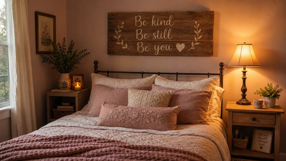
Choosing the Right Materials for Your Custom Sign
The material you go with will shape both how your sign looks and how long it lasts. Wood is probably the most popular choice for DIY signs, and it’s easy to see why — it’s easy to find, affordable, simple to work with using basic tools, and incredibly flexible when it comes to finishes. Raw wood has this natural, organic warmth to it, while painted or stained wood can be adapted to suit pretty much any color scheme. Reclaimed or distressed wood brings in character and a sense of history that feels right at home in farmhouse or vintage-inspired rooms.
Canvas is another great option, especially if you lean toward a more painterly, artistic approach. You can work with acrylics, stencils, or even watercolor for a softer, more flowing result. Canvas is lightweight, easy to hang, and comes in tons of pre-stretched sizes. For rooms with a boho or artistic vibe, canvas can feel more expressive and organic than a stiff wooden board. It also plays nicely with layering and mixed-media techniques that wood doesn’t always accommodate as well.
If you’re after something more modern and polished, acrylic sheets, metal, or even foam board with a painted finish are all worth considering. Acrylic signs — especially backlit ones or those combined with vinyl lettering — have a sleek, contemporary look that works beautifully in minimalist or Scandinavian-inspired spaces. Foam board is a budget-friendly option that, with the right treatment, can look surprisingly professional. Whatever you land on, think about how the material’s texture interacts with what’s already in your room. A little contrast between rough and smooth, or matte and glossy, goes a long way.
Design Elements: Fonts, Colors, and Composition
Typography might be the single most defining thing about a sign. The font you pick sets the tone before anyone even reads a word. Script fonts feel romantic and personal — great for bedroom signs with meaningful quotes or names. Bold block letters feel confident and graphic, which works really well in rooms with a strong, defined aesthetic. Hand-lettered fonts have a warmth and slight imperfection that machine-cut vinyl just can’t replicate, making them a wonderful choice when personality is the whole point.
Color should always be chosen in direct response to what’s already in your room. One approach that works really well is pulling exact colors using paint swatches or a color-matching app. If your room has navy and gold accents, a sign in deep navy with gilded lettering is going to feel cohesive and intentional. You could also find a color that’s been playing a minor role in your room and bring it front and center on the sign, giving it a moment while tying everything together. Neutral backgrounds — white, cream, black, or natural wood tones — are your safest bet if you want maximum versatility with accent colors.
Composition is how all your elements sit together within the sign’s space, and it’s honestly what separates a polished-looking piece from a cluttered one. A few things to keep in mind as you design:
- Use negative space on purpose — cramming too much into a sign makes it hard to read and exhausting to look at.
- Balance large and small text — a main phrase in big lettering with a smaller supporting line underneath creates hierarchy and keeps things interesting.
- Align things carefully — even freehand signs benefit from a light pencil grid to keep everything level and proportional.
- Stick to two or three colors — it’s usually all you need to keep the design clean and cohesive.
- Think about borders and embellishments — simple floral sprigs, geometric lines, or small icons can frame your text without taking over.
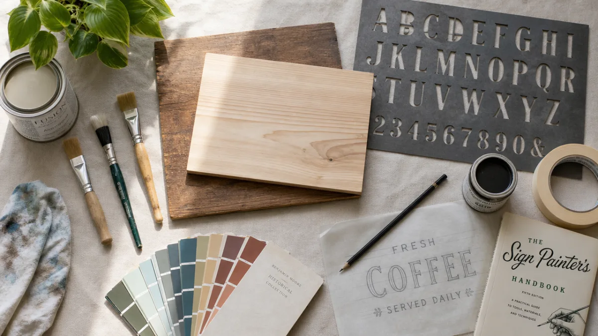
Step-by-Step Guide to Making Your Sign
Once you’ve done your planning and gathered your materials, you can actually start making the thing. Begin by prepping your base. If you’re working with wood, sand it smooth with medium-grit sandpaper, wipe off the dust with a damp cloth, and let it dry completely. If you want a smooth, even surface for your design, put down a coat of gesso or white primer and let it cure before moving on. Surface prep is the step beginners most often skip, and honestly, it’s usually the difference between a result you’re proud of and one that frustrates you.
Next, get your design onto the surface. How you do this depends on your skill level and what tools you have. The transfer paper method is pretty reliable — print or draw your design, coat the back with graphite, then trace over the lines to transfer them lightly onto your sign. Stencils, whether you buy them or cut your own from cardstock, are a beginner-friendly option that gives you clean, consistent lettering without a lot of stress. If you’re more experienced, freehand is always an option. And if you have a cutting machine like a Cricut or Silhouette, vinyl decals give you that crisp, precise finish that’s hard to beat for a modern look.
With your design in place, it’s time to paint, ink, or apply whatever medium you’ve chosen. Work in thin layers, letting each coat dry fully before adding the next — this prevents drips and keeps your colors clean. Use a fine liner brush for details and edges, and a flat brush for filling in bigger areas. Once everything is dry, seal the surface with an appropriate finish — matte medium for a soft, natural look, or a glossy varnish if you want something more polished and durable. Add your hanging hardware, step back, and take a moment to appreciate what you just made.
Styling and Displaying Your Handmade Sign
Making the sign is only half the project — how you display it matters just as much. A beautiful handmade sign hung without any thought can fall flat, but a carefully styled sign can anchor an entire room. Think about visual weight. If your sign is large and bold, keep the things around it simpler so they’re not competing with it. If your sign is smaller and more delicate, grouping it with complementary objects — photos, plants, Candles, small framed prints — can create a layered, curated little vignette that feels really intentional.
Lighting matters more than most people realize. Natural daylight shows off your sign’s true colors and textures, while warm ambient lighting in the evening makes the same sign feel cozier and more intimate — almost like a different piece entirely. Try positioning a small spotlight, fairy lights, or a clip-on LED near your sign to give it some extra presence. Backlit signs — especially acrylic or wood with routed lettering — completely transform at night, going from a daytime decorative object to a glowing focal point that changes the whole feel of the room.
Don’t feel like your display has to be permanent. One of the best things about handmade signs is that they’re personal, and your taste and your room will change over time. Seasonal updates, new color schemes, or just rearranging what’s around your sign can make it feel fresh again. A lot of crafters find that making one sign just leads to making more — slowly building a gallery wall of their own handmade pieces that grows and shifts along with them. That kind of ongoing creative engagement with your space is one of the most genuinely rewarding parts of the DIY lifestyle.
Inspiring Ideas and Variations to Try
Once you’ve got the basics down, a whole world of possibilities opens up. Neon-style signs made with LED flex strip lights and a backing board have become hugely popular, and they bring such a fun, bold energy to bedrooms, home offices, and entertainment spaces. Spell out a word that means something to you, a simple shape like a lightning bolt or heart, or just a symbol you love — the result doubles as both decor and mood lighting. These look especially dramatic in rooms with a darker color scheme where the glow really gets to pop.
Marquee letter signs — those chunky, three-dimensional letters you always see at weddings — can actually be made at home using cardboard, foam, or hollow letter frames you fill with fairy lights. Spell out your initials, a word like “DREAM” or “LOVE,” or something that captures your room’s whole theme. They add a playful, festive energy without feeling out of place in a well-designed space, and they work especially well in kids’ rooms, teen bedrooms, and creative studios where personality is just as important as style.
For something a little more subtle and sophisticated, consider typographic prints on large-format paper or fabric, framed simply and hung with care. There’s also abstract sign-making, where the focus is on shape, texture, and color rather than words — a piece of driftwood painted in ombre tones, or a canvas covered in textured plaster with a geometric design pressed into it, can function as a real statement piece without a single letter on it. The possibilities genuinely are endless, limited only by your imagination and whatever your room’s unique personality is asking to express.








What do you think?
It is nice to know your opinion. Leave a comment.