










Before & After: Small Home Office Transformation — How to Turn a Cramped Corner Into a Productive Sanctuary
There is something quietly powerful about a well-designed workspace. It signals intention, sets boundaries between rest and effort, and — perhaps most importantly — shapes how you feel when you sit down to do your best work. Yet for millions of people working from home, the reality looks nothing like those aspirational images pinned to mood boards at midnight. It looks like a folding table wedged between a laundry pile and a forgotten exercise bike, bathed in the cold overhead glow of a single ceiling bulb. That was the starting point for this transformation, and what happened next is a testament to the idea that square footage is far less important than thoughtful planning.
This particular home office occupied a corner of a spare bedroom measuring just eight by ten feet — a space most designers would consider barely viable. The original setup included a scratched pressboard desk, a mismatched dining chair that caused persistent lower back pain after thirty minutes, cables snaking across the floor in every direction, and shelving that had slowly become a graveyard for items that had no other home. Natural light was blocked by heavy curtains chosen years ago for a different room entirely. The atmosphere communicated chaos rather than calm, distraction rather than focus.
What this transformation demonstrates is that the constraints of a small home office are not obstacles to good design — they are the design brief itself. Every decision made in a tight space carries more weight, which means every decision made well yields a proportionally greater return. The following sections walk through the philosophy, process, and practical steps behind this before-and-after journey, offering a replicable framework for anyone ready to stop tolerating their workspace and start genuinely enjoying it.
Assessing What Was Wrong: An Honest Audit of the Original Space
Before a single piece of furniture was moved or a single paint chip considered, the first step was conducting a thorough, unsentimental audit of the existing space. This meant spending a full workday in the room — not just glancing around and making assumptions — and noting every point of friction. What caused the first wave of irritation in the morning? Where did time get wasted searching for items? When did discomfort begin, and what triggered it? This kind of observational honesty is the foundation of any meaningful redesign, because it grounds the process in lived experience rather than aesthetic fantasy.
The audit revealed five core problems. Storage was completely inadequate, resulting in horizontal surfaces being buried under papers, chargers, notebooks, and miscellaneous objects that drifted in from other parts of the home. Ergonomics were entirely neglected — the chair height, monitor position, and keyboard placement were all wrong in ways that accumulated into real physical strain over the course of a working week. Lighting was the single overhead fixture, which created harsh shadows on the desk surface and caused eye fatigue by mid-afternoon. Acoustics had never been considered at all, and the hard walls and bare floor created an echo that made video calls feel uncomfortably clinical. Finally, the visual environment offered zero inspiration — bare walls painted a flat, institutional beige communicated nothing about the person who worked there.
Naming these problems precisely made the solution set much clearer. Rather than approaching the redesign as a general aesthetic upgrade, each intervention could be evaluated against a specific complaint. This prevented the common pitfall of spending money on decorative elements while leaving the functional issues untouched. A beautiful room that still hurts your back after an hour is not a successful transformation — it is simply a more attractive version of the same failure. The audit gave this project a sense of purpose and a measurable definition of success before any purchases were made.
The Planning Phase: Designing on Paper Before Touching a Thing
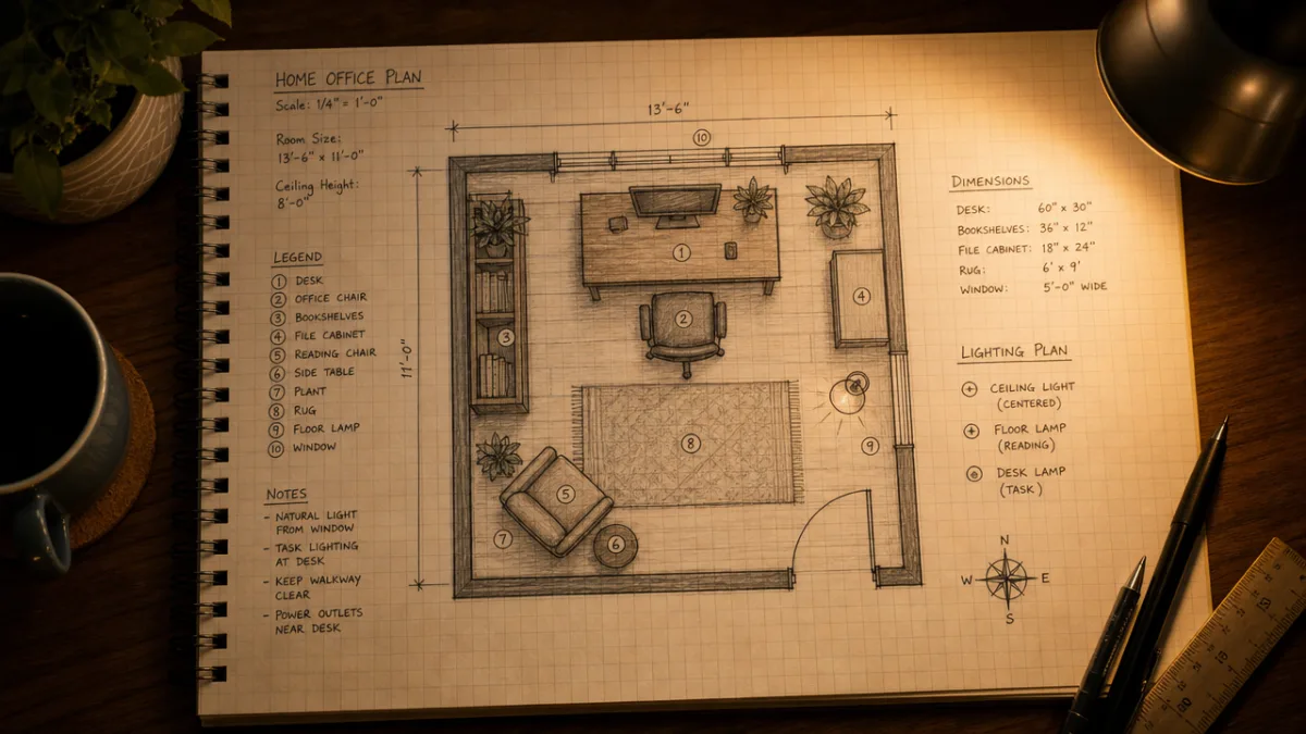
Armed with a clear problem statement, the next phase was planning — and this is where many home improvement projects go wrong by moving too quickly into action. The temptation to simply start buying things online, drawn in by attractive product photography and enthusiastic review sections, is very real. Resisting it requires discipline, but the payoff is significant. Planning on paper first, working to scale, forces a confrontation with spatial reality that digital browsing conveniently obscures. A desk that looks perfectly proportioned in a lifestyle photograph may, in practice, consume sixty percent of your available floor space and block the only door.
A simple floor plan was drawn on graph paper, with each square representing six inches. Doors, windows, and electrical outlets were all mapped accurately, because these fixed elements constrain the design in ways that cannot be argued with. From there, several different furniture arrangements were sketched and evaluated. The goal was to maximize the sense of openness while ensuring the desk faced a direction that would minimize screen glare from the window, keep the door within peripheral vision to reduce the startle response when someone entered, and allow for a clear zone of floor space that could be used for brief movement breaks throughout the day.
The planning phase also involved a hard conversation about priorities. With limited space, every item needed to justify its presence. A dedicated printer stand was eliminated in favor of a wireless printer tucked on a lower shelf. A two-drawer filing cabinet was replaced by a slim, wall-mounted document organizer. The intention was not minimalism for its own sake, but right-sizing — matching the amount of furniture and storage to the actual volume of work that happened in the space, rather than to an imagined future version of work that required different equipment. This disciplined thinking about necessity is what separates a genuinely transformed space from one that has simply been rearranged.
The Furniture Choices: Functionality Without Sacrificing Style
With a clear plan in place, selecting furniture became far less overwhelming. The desk was the anchor piece and the most important decision of the entire project. After considerable research, a wall-mounted fold-down desk was chosen over a freestanding option. This single decision transformed the spatial dynamics of the room entirely. When open, it provided a generous work surface. When closed, it reclaimed that floor space completely, making the room feel dramatically larger during evenings and weekends when the office function was not needed. The desk surface was finished in a warm white oak veneer that balanced the practical benefits of a wall-mount with the warmth of natural-looking wood grain.
The chair selection received as much attention as the desk, because no investment in home office design has a more direct and immediate return than a genuinely ergonomic seat. The chair chosen offered adjustable lumbar support, armrest height, seat depth, and recline tension — not as luxury features, but as basic requirements for someone spending six to eight hours seated each day. It was upholstered in a muted sage green that added a quiet note of color to the space without competing with the overall calm, neutral palette. Within the first week of use, the persistent lower back pain that had defined the previous setup was already markedly reduced.
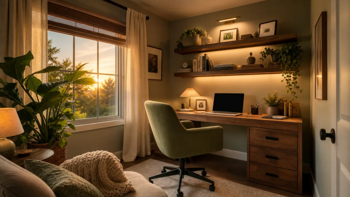
Storage solutions were selected with the same dual standard of function and form. Floating shelves mounted above the desk allowed books, binders, and decorative objects to coexist at eye level without consuming floor space. A pegboard panel, mounted flush against the wall beside the desk, provided a flexible, reconfigurable system for organizing small tools, cables, notebooks, and frequently accessed items. This eliminated the drawer-diving that had previously punctuated every working hour. Beneath the desk, a compact rolling cart with two shallow drawers handled supplies, and its mobility meant it could be pulled away to create additional floor clearance when needed.
Light, Color, and Atmosphere: The Invisible Architecture of Productivity
Once the furniture was in place, the transformation shifted to the elements that shape the felt quality of a space — light, color, and sensory atmosphere. These are the components most often treated as finishing touches, but they actually determine how a room makes you feel at a fundamental level. Poor lighting is not a minor inconvenience; it is a daily tax on your energy, your eye health, and your mood. The overhead fixture that had previously served as the room’s sole light source was left in place but relegated to a secondary role, used only when cleaning or searching for something on a lower shelf.
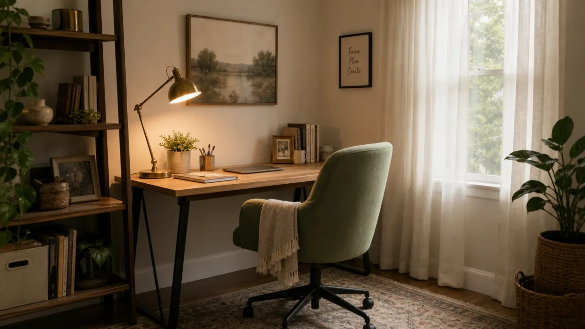
In its place, a layered lighting system was installed. A daylight-spectrum LED desk lamp with adjustable color temperature sat at the corner of the work surface, providing focused task lighting that could be warmed for late afternoon sessions and cooled to a crisp white for morning productivity. A small, dimmable floor lamp was placed in the back corner of the room, adding ambient light that reduced the harsh contrast between a bright screen and a dark surrounding room — one of the leading causes of digital eye strain. Finally, the heavy curtains were replaced with sheer linen panels that allowed natural light to diffuse softly into the room throughout the day without creating direct glare on the monitor.
The wall color moved from the original flat beige to a soft, warm white with the faintest undertone of greige — a color that reads as neutral without feeling cold or clinical. This change alone made the room feel measurably larger and cleaner. A single accent wall behind the desk was painted in a muted dusty blue, a color with well-documented associations with calm focus. On that wall, a combination of framed artwork, a small analog clock, and a section of corkboard created a composition that was visually intentional without being overcrowded. The overall atmosphere shifted from something that whispered “temporary” to something that clearly communicated “this is a real place where real work happens.”
Cable Management and the Details That Define Polish
There is a reliable rule in interior design: the difference between a room that looks “nice” and a room that looks genuinely professional lies almost entirely in the details. And in a home office, no detail is more immediately visible or more chronically neglected than cable management. Cables are the background radiation of the modern workspace — always present, always slightly chaotic, always subtly communicating that the space is not quite under control. Addressing them is unglamorous work, but the visual payoff is immediate and lasting.
The cable management solution in this transformation used a combination of approaches rather than a single product. Cable channels in a color matched to the baseboard were run along the wall beneath the desk, bundling the monitor cable, laptop charger, and external drive into a single clean line. A small cable management box on the desktop surface concealed the power strip and the tangle of adapters that accumulate around any modern workstation. Individual cables were labeled at both ends with small printed tags — a detail that sounds obsessive until the first time you need to unplug and repack your workspace in a hurry and can identify every cable at a glance. A wireless keyboard and mouse eliminated the two most visually distracting cables entirely.
Beyond cables, the final details that completed the transformation included a small ceramic planter on the floating shelf holding a pothos — a plant chosen specifically for its tolerance of variable light conditions and its documented air-quality benefits. A wooden desk mat protected the fold-down surface while providing a tactile warmth that the bare veneer lacked. A small Bluetooth speaker sat on the lower shelf, and a minimal cable channel guided its wire out of sight. A set of matching storage boxes on the upper shelf unified the look of what would otherwise have been an assortment of mismatched containers. Each of these individual choices was modest in cost and effort. Together they created a cohesive, finished environment that bore almost no resemblance to the cluttered, improvised corner that had existed before.
The After: What the Transformation Actually Changed
The most meaningful measure of any workspace redesign is not how it photographs — it is how it functions across the full texture of a working week. Two months after the transformation was completed, the changes in daily experience were concrete and quantifiable. Morning resistance to sitting down and starting work had dropped significantly; there is a psychological readiness that a well-ordered, visually calm space creates that a chaotic one simply cannot. The physical discomfort that had previously begun within the first hour of work had been almost entirely eliminated by the combination of an ergonomic chair and a correctly positioned monitor.
Productivity, which is genuinely difficult to measure, showed qualitative improvement in several specific ways. Time wasted searching for items fell sharply because every category of object had a designated home and the storage systems made retrieval immediate and intuitive. The layered lighting system reduced afternoon eye strain to a degree that extended effective working hours without increased discomfort. Video calls, which had previously felt slightly embarrassing against a backdrop of visual disorder, became something approached with more confidence — the clean, composed background of the new office communicating the same professionalism that a physical office might once have provided.
Perhaps the most unexpected benefit was the psychological boundary that the redesigned space created within the home. Because the room now felt genuinely different from every other room in the house — purposeful, specific, considered — it became easier to transition mentally between work and personal time. Entering it signaled work; leaving it signaled release. This kind of environmental cueing is something behavioral researchers have noted as increasingly important for remote workers navigating the absence of physical commute and spatial separation between professional and domestic life. The transformation, in other words, did something that no amount of time-management advice alone can accomplish: it used the design of the environment itself to support the rhythms and disciplines that good work requires.
Key Lessons from This Transformation
For anyone considering a similar project, the following principles distilled from this process are worth holding onto as guiding commitments rather than optional suggestions. They apply regardless of budget, room size, or existing furniture, because they are fundamentally about approach rather than resources.
- Audit before you buy. Spend real time diagnosing what is wrong with your current space before making a single purchase. Solutions attached to accurately named problems are far more effective than solutions purchased in search of a problem to solve.
- Plan to scale. Draw your space on graph paper and work out furniture arrangements before anything is ordered. What fits in theory on a website product page may not fit in practice in your room.
- Prioritize ergonomics above aesthetics. A beautiful room that causes you physical pain is a failure. A slightly plain room that supports your body correctly for eight hours is a success. If budget forces a choice, comfort wins.
- Address lighting as a system, not a fixture. Task light, ambient light, and natural light each serve different functions. A room with only one of the three will always feel incomplete.
- Manage cables before anything else is considered finished. Visible cable chaos undermines every other design decision in its proximity. Deal with it completely and the rest of the room will look significantly better without any further change.
- Give everything a home. Storage is only effective when every item has a specific designated location that is intuitive enough to be used consistently, not just when tidying for a video call.
The before state of this office was not unusual — it was, in fact, entirely ordinary. That is precisely what makes the after state so encouraging. The transformation did not require a large budget, a professional interior designer, or a significant renovation. It required honest assessment, careful planning, disciplined prioritization, and a willingness to invest attention in a space that had previously been treated as a placeholder. The result is a room that actively supports the work done within it, rather than passively resisting it — which is, ultimately, everything a home office needs to be.








What do you think?
It is nice to know your opinion. Leave a comment.